

A Blackdown re-design
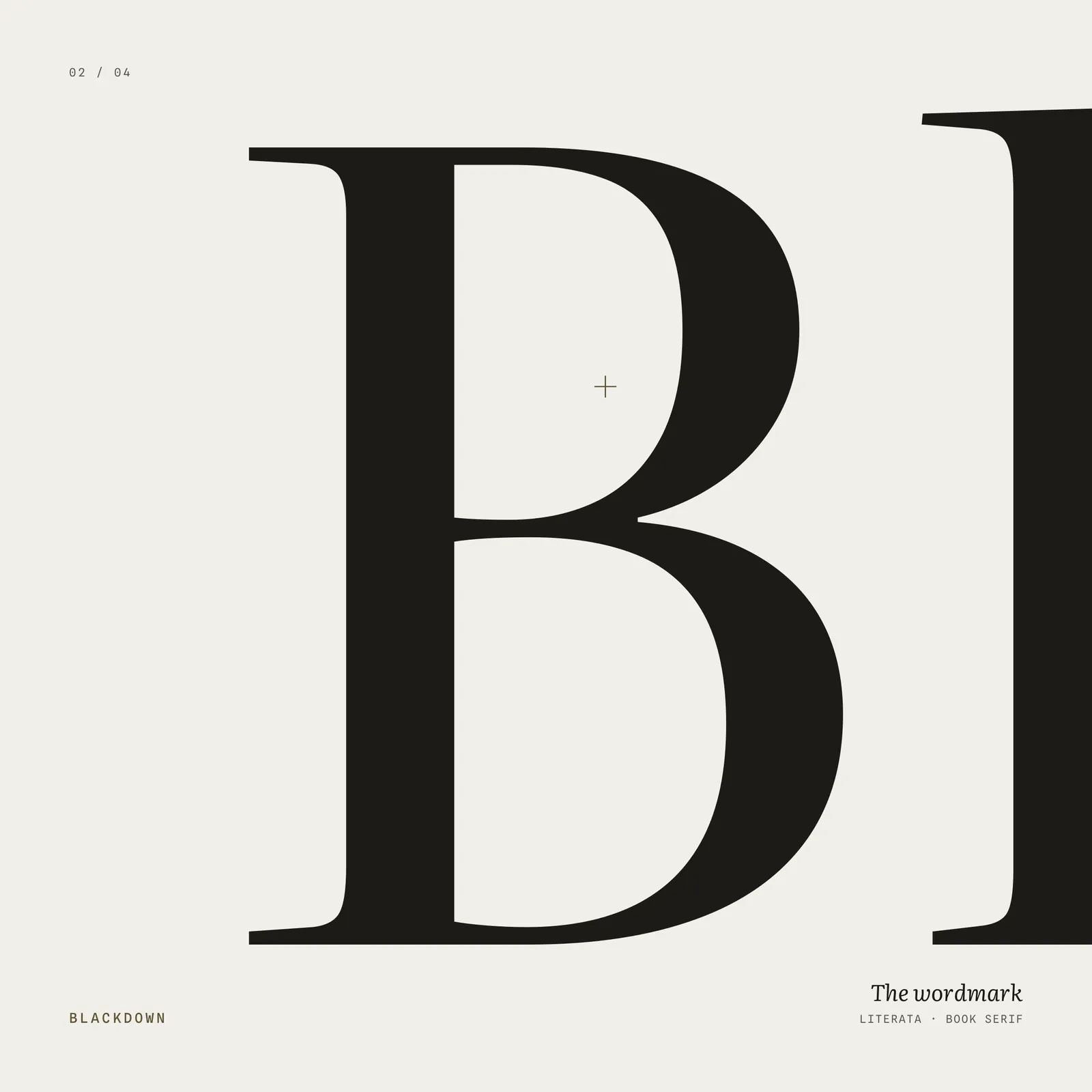
We named our company after the highest hill in our home county - ‘Black Down’ in West Sussex - so it seemed fitting to encapsulate the topography of that very landscape into our homepage. But first we needed to establish what we were trying to achieve and why.
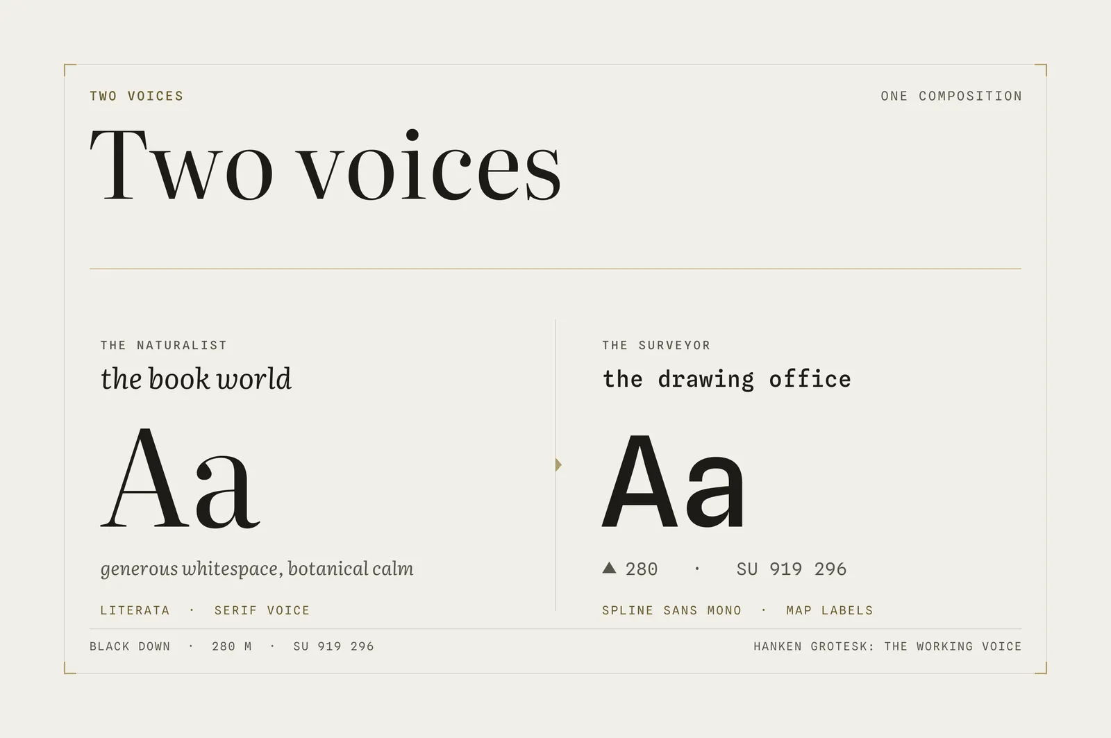
We sought to create something that embodies what we value in business - it should feel elegant and natural whilst also being precise, technical and timeless. Our two most important client verticals to date have been nature (ecology, rewilding, conservation) and tech (deep tech, startups) so the design had to balance two voices:
- The Naturalist - the botanical book world: Literata, elegant illustrations, generous use of whitespace, long-form writing, botanical plates
- The Surveyor - the drawing office: mono annotations, hairline linework, measured labels, technical drawings
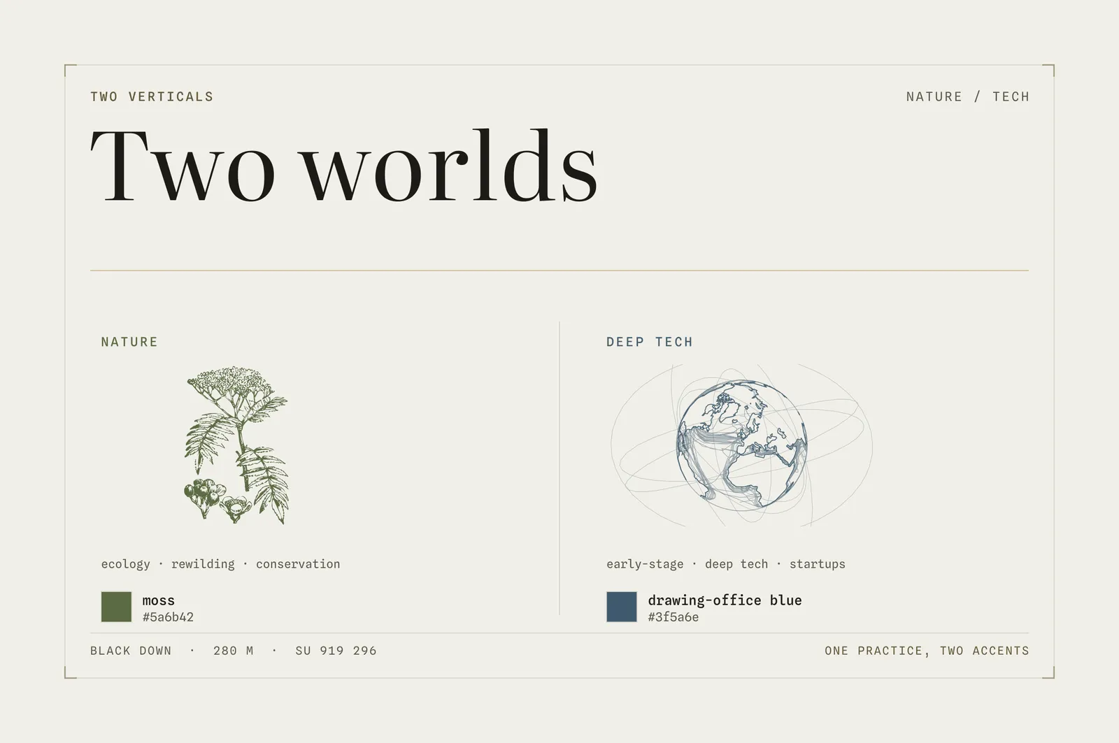
These are two quite distinct worlds we that don’t easily sit together. We worked to develop a style that treated each with respect, while building a style and voice of our own that reflects our own tastes. A’ Moss’ green was chosen for accenting our Nature focused content, ‘Drawing-Office Blue’ for the Tech:
We value honesty in design - by which we mean everything on the site has to earn its place by meaning something, rather than being pure ornamentation for decoration’s sake. For Blackdown we took our rooting in the South Downs seriously, researching the fauna found on Black Down itself, and explored how we might use this on the site. A rich library of possible plants emerged from this, including Dwarf Gorse, Ling, Bracken and Rowan.
We experimented with generating parametric shapes from scratch - the fern seen on the left in the plate below, but weren’t happy with the results:
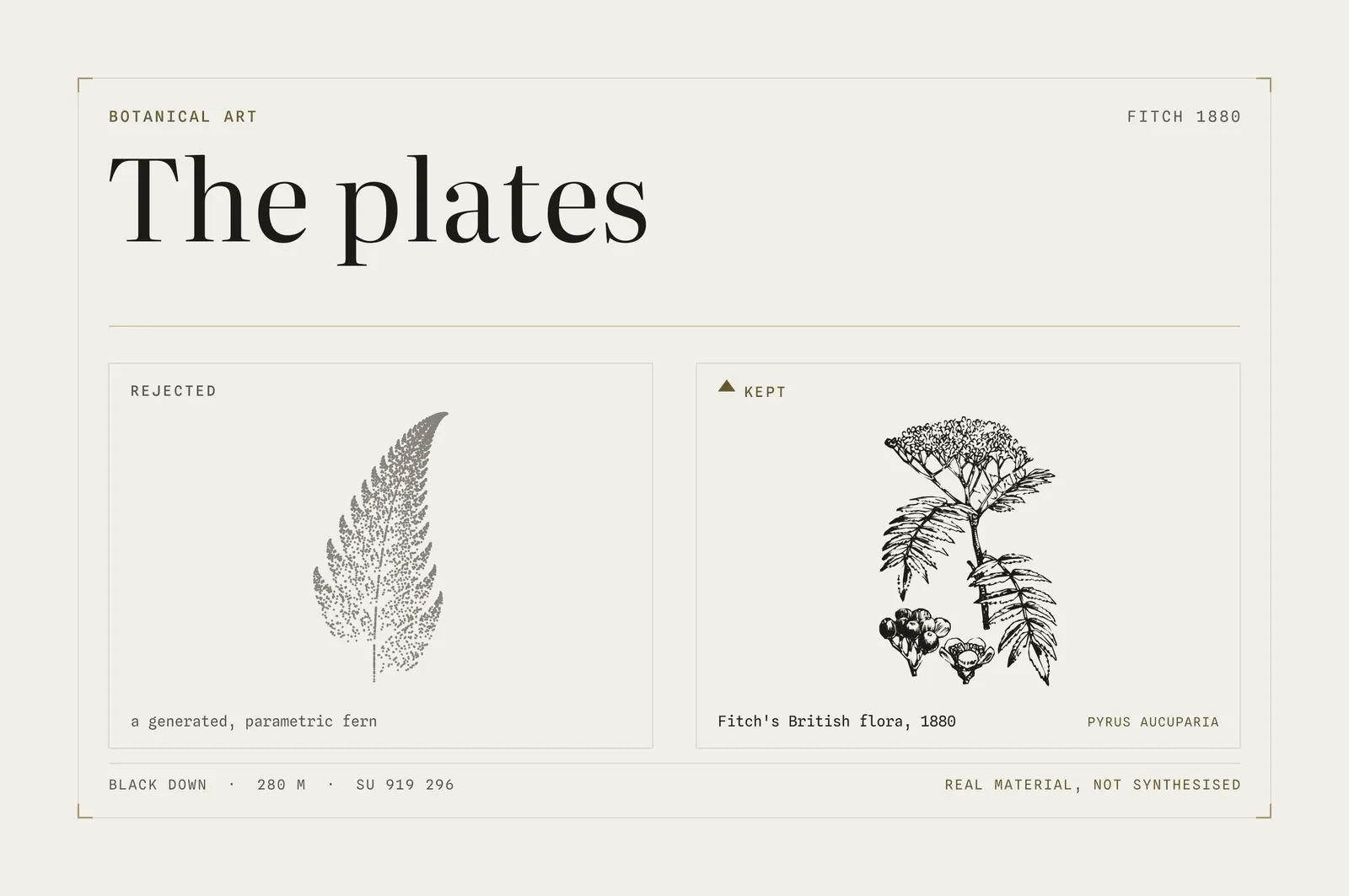
What we found instead was a stunning public domain source - W. H. Fitch, Illustrations of the British Flora (L. Reeve & Co., 1880) - containing fine, botanical line-cut wood engravings of British plants. Walter Hood Fitch was one of the leading botanical illustrators of the Victorian era. We built a pipeline to turn his engravings into single path SVGs; first creating a wanted list of plants from those native to Black Down, then an OCR tool to scan through the volume, crop plants out and clean up the extractions from the Victorian originals. After several iterations the results were encouraging:
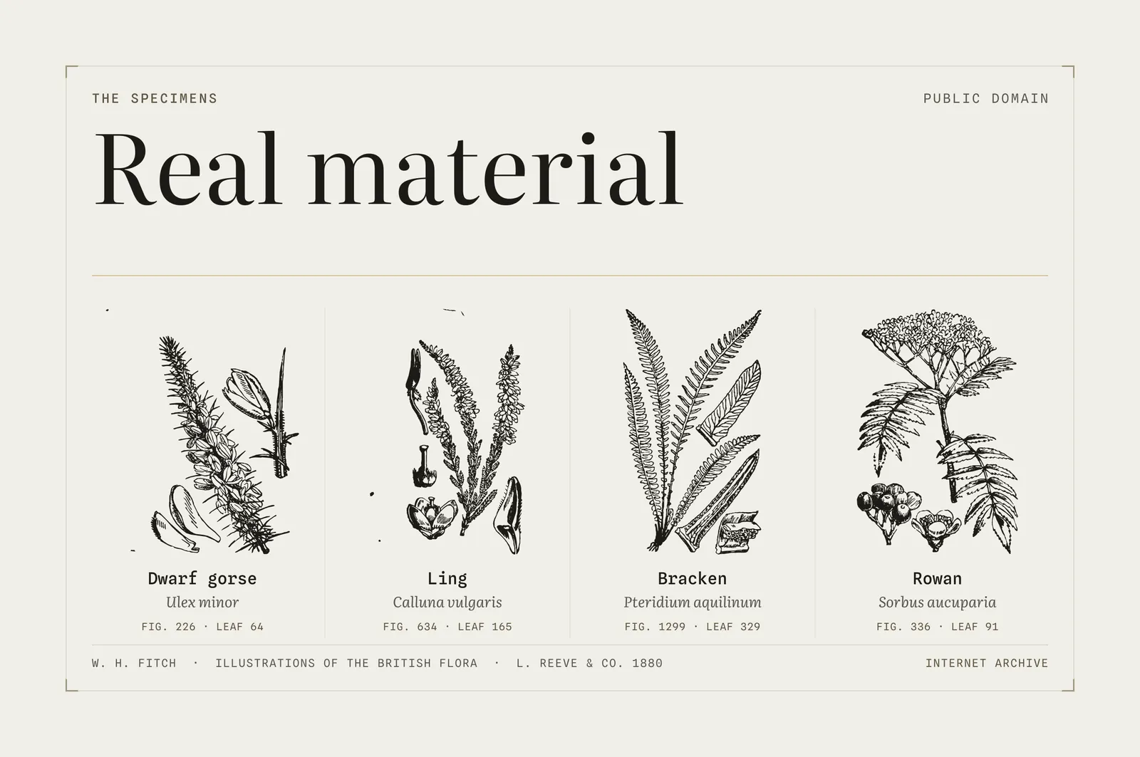
With some clean-up applied, careful selection and many layout iterations, we had created our own library of botanical illustrations that served the Nature side of our business well.
Light and Dark
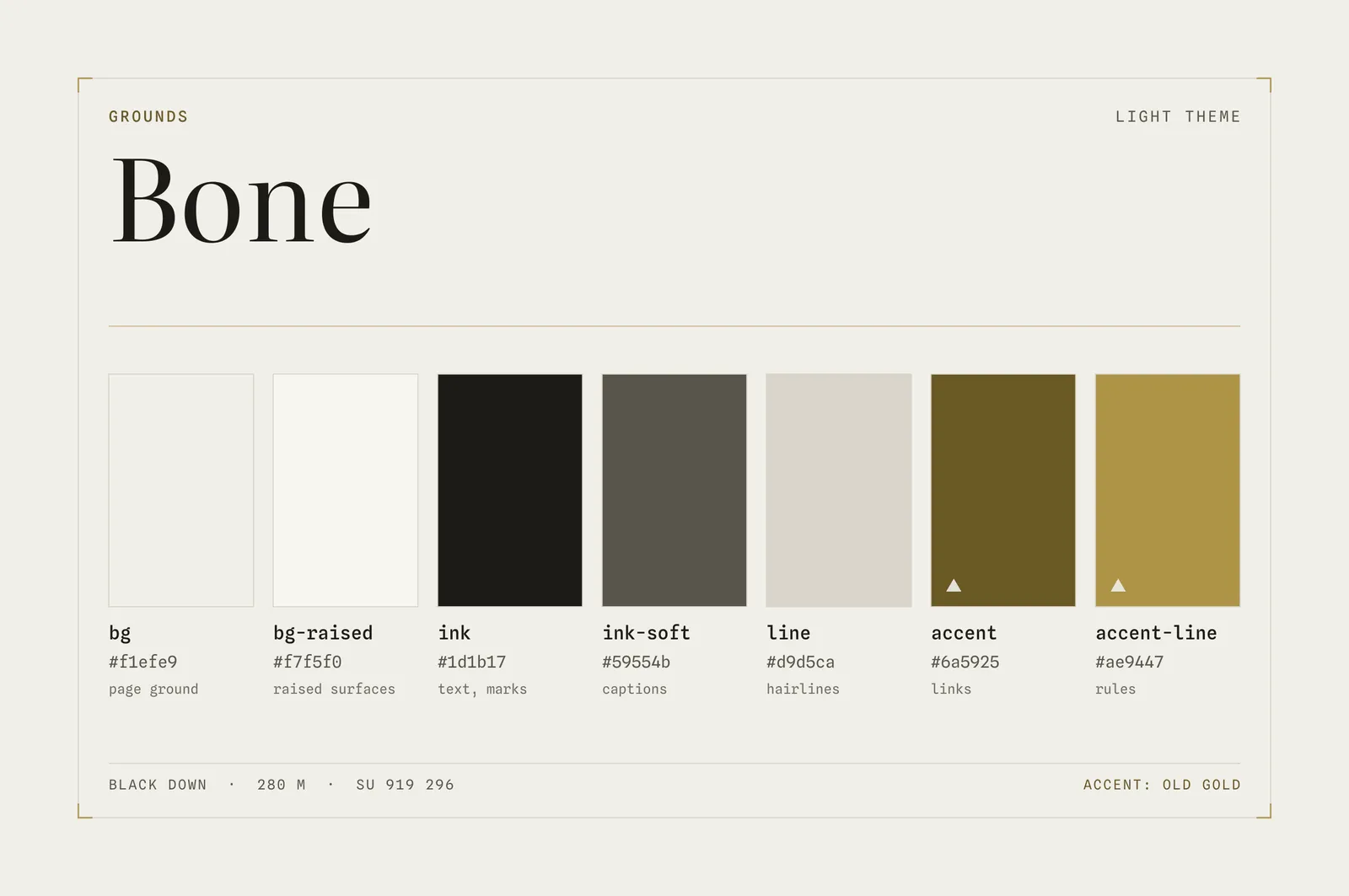
We work at screens a lot, making judicious use of dark mode to relieve strain on our eyes. As such we always wanted a palette and aesthetic that worked in both light and dark modes. Our light mode palette is ‘Bone’ - we tried to pick colours that meant something - our ‘Old Gold’ accent for example, being close to the gorse that flowers year round on Black Down. This palette also carries the influence of the summer in which it was developed, surrounded as we have been in recent months by the straw stubble fields of Sussex, in the driest summer here since either of us were born:
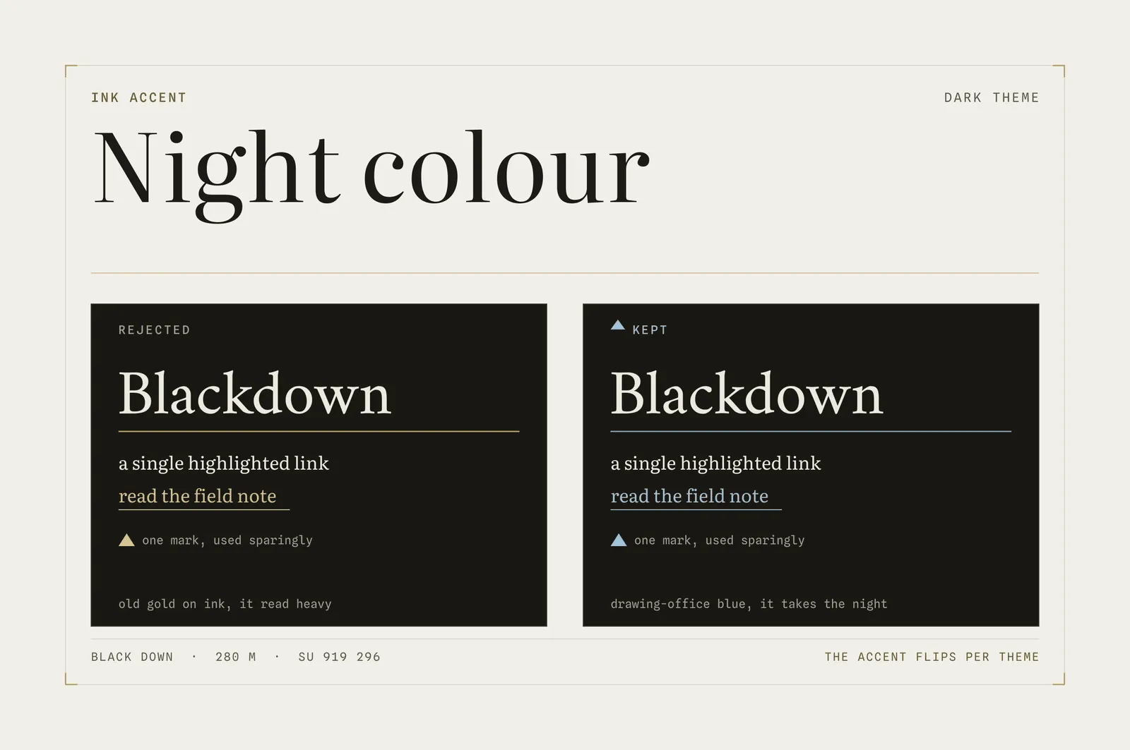
The inverse palette for night mode didn’t quite work for us, so we experimented with something different. Looking to the technical side of our portfolio we landed on Drawing-Office Blue as the accent instead:
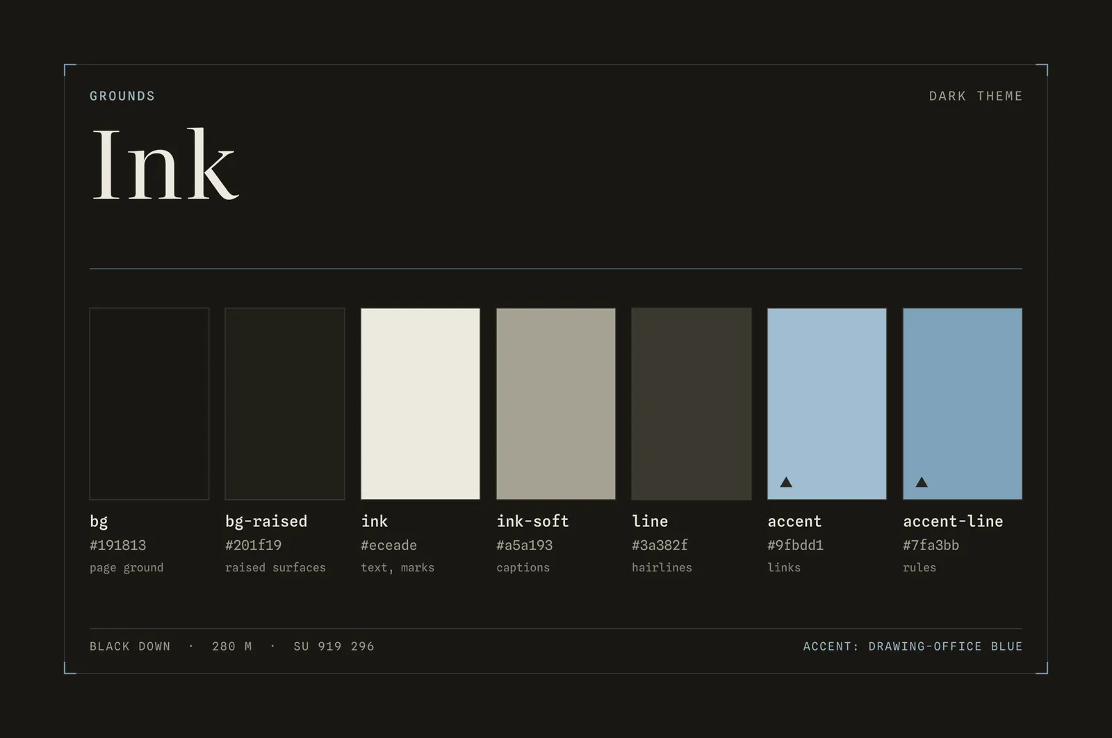
We call our dark palette ‘Ink’, an homage both to the inky blackness of the dark skies of the South Downs - renowned for stargazing - and to the aesthetic of the analogue era drawing rooms that produced British design classics like Concorde and the Mini.
Typography
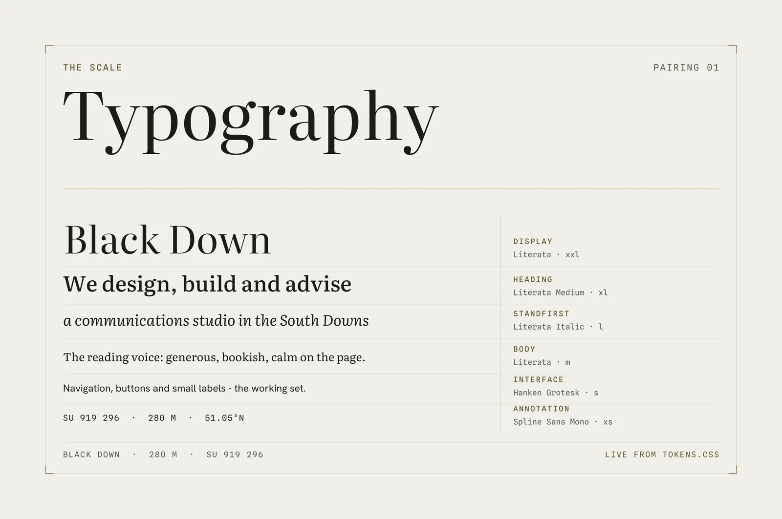
With the serif font locked in for the wordmark we built out a typographic set. Display and headings would share that same Literata font, albeit in different sizes, with standfirst subtitles using it italicised. We liked the ‘bookish’ look and readability of Literata so much that we flowed it through to all our body copy too. Both of us love literature and are voracious readers, so this felt like the right fit on so many levels.
There’s a real timelessness and elegance to a sharp serif font that fits well with our ambitions for this business to grow with us over decades. Books are artefacts with a satisfying degree of permanence in an increasingly ephemeral world, and an identity that nods to the literary world felt like it helped convey the message that we still intend to be here in years to come too!
The font family is rounded out with a Sans and a Mono - a hint at the other, more technical side of our studio and skillset. Spline Sans Mono is used for measurement furniture - grid references, place names, height marks on contour maps. Hanken Grotesk is our interface font - the working parts of the site like menus, buttons and little labels:
The Hill
Our idea for a ‘Homepage Hero’ element was to move on from the stock library photo of a hill we’d had on our old site to a visual of Black Down itself. It felt more honest. But, as is so often the case with design, it proved far less easy to pull off convincingly than we’d first anticipated! We soon realised photography wasn’t going to fit with our new aesthetic and looked for something else. Again we tried to do something generative, creating contour line maps from scratch with AI tools. Nothing seemed right - the lines weren’t real - it felt fake:
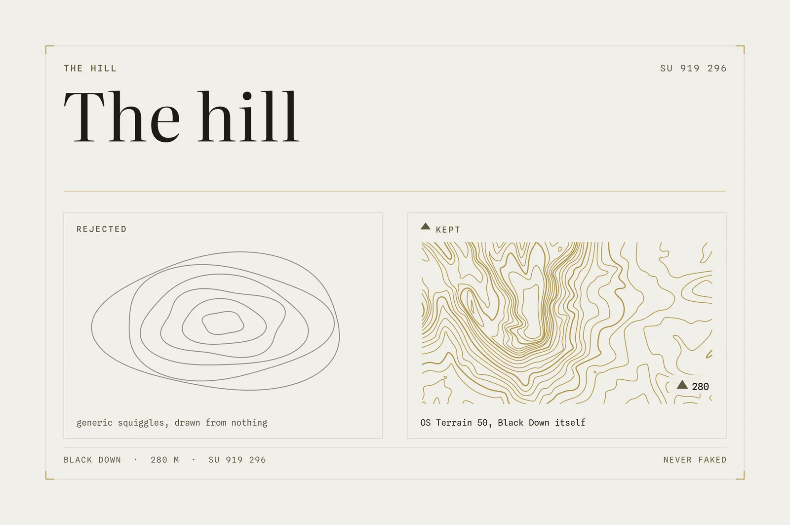
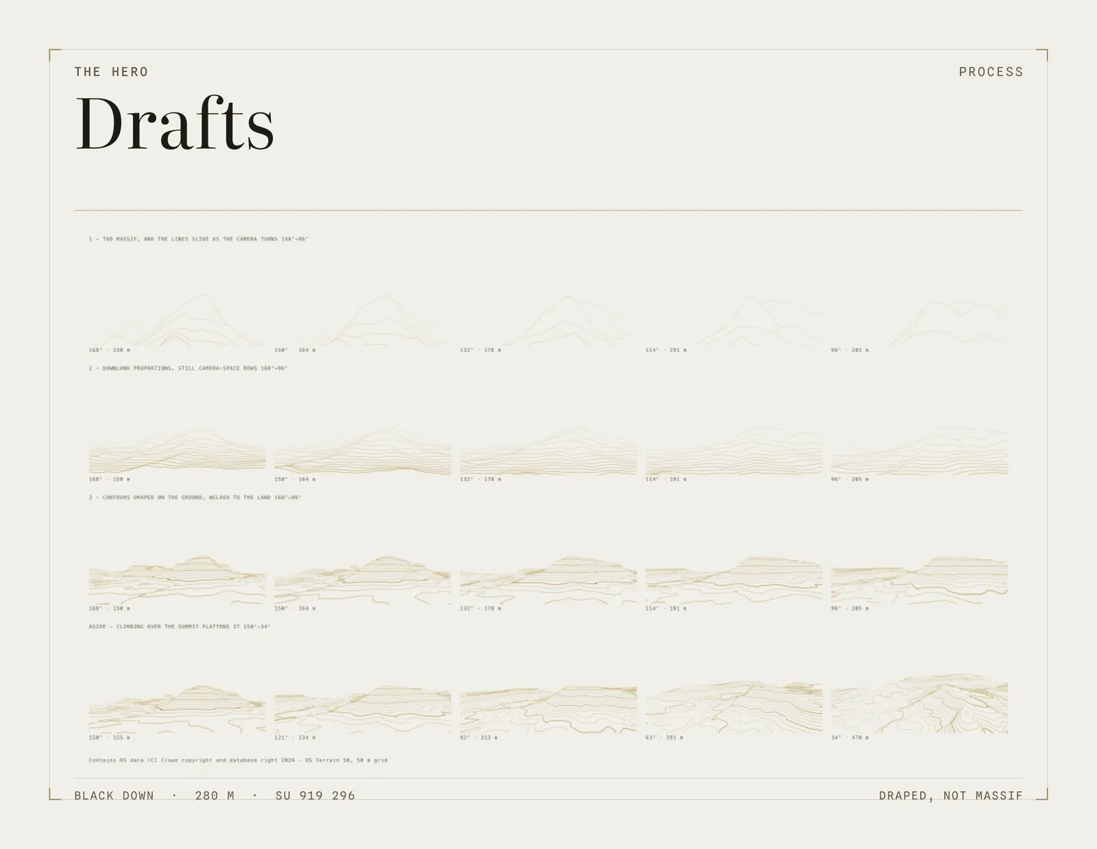
Instead we reached for another British institution - Ordnance Survey. We obtained real, Open Government Licenced elevation data of the hill we named the studio after and turned it into contour and ridge profile assets for the site. After defining an area of the Downs around the peak itself to focus on, we took both a plan view of a 5 x 6 km window with 10m contours and seven separate east-west elevation transects across 10km runs. We then played with different levels of vertical exaggeration and a range of establishing-shot style treatments.
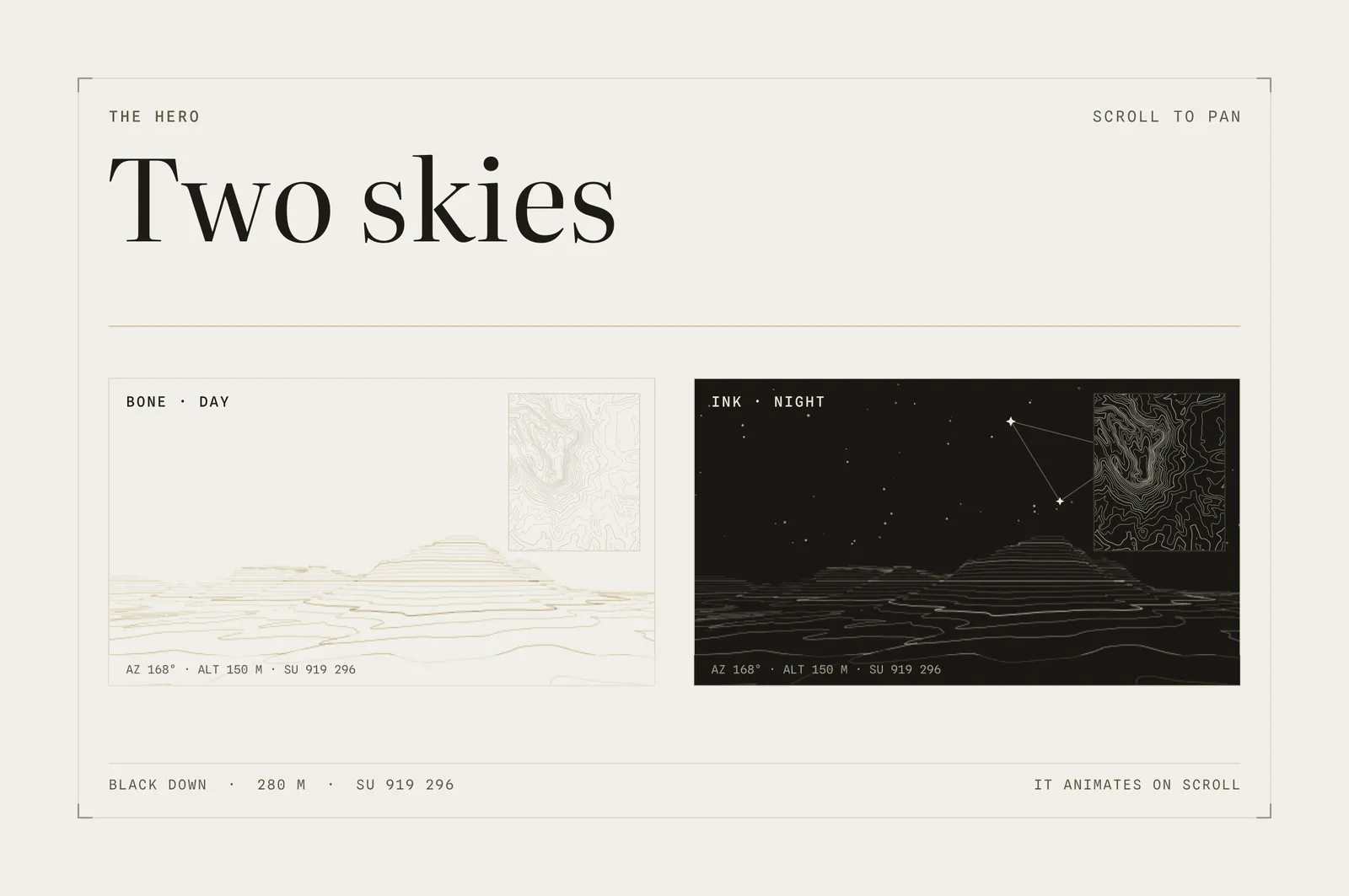
The final flourish was to apply a pan-like motion to the graphic as a user scrolled the page, to draw them into the South Downs landscape - there’s even an azimuth and elevation key that updates as the scroll moves the view. Spot heights are marked with small filled triangles - like trig points on OS maps - and an elevation marker. Labels and grid references are uppercased.
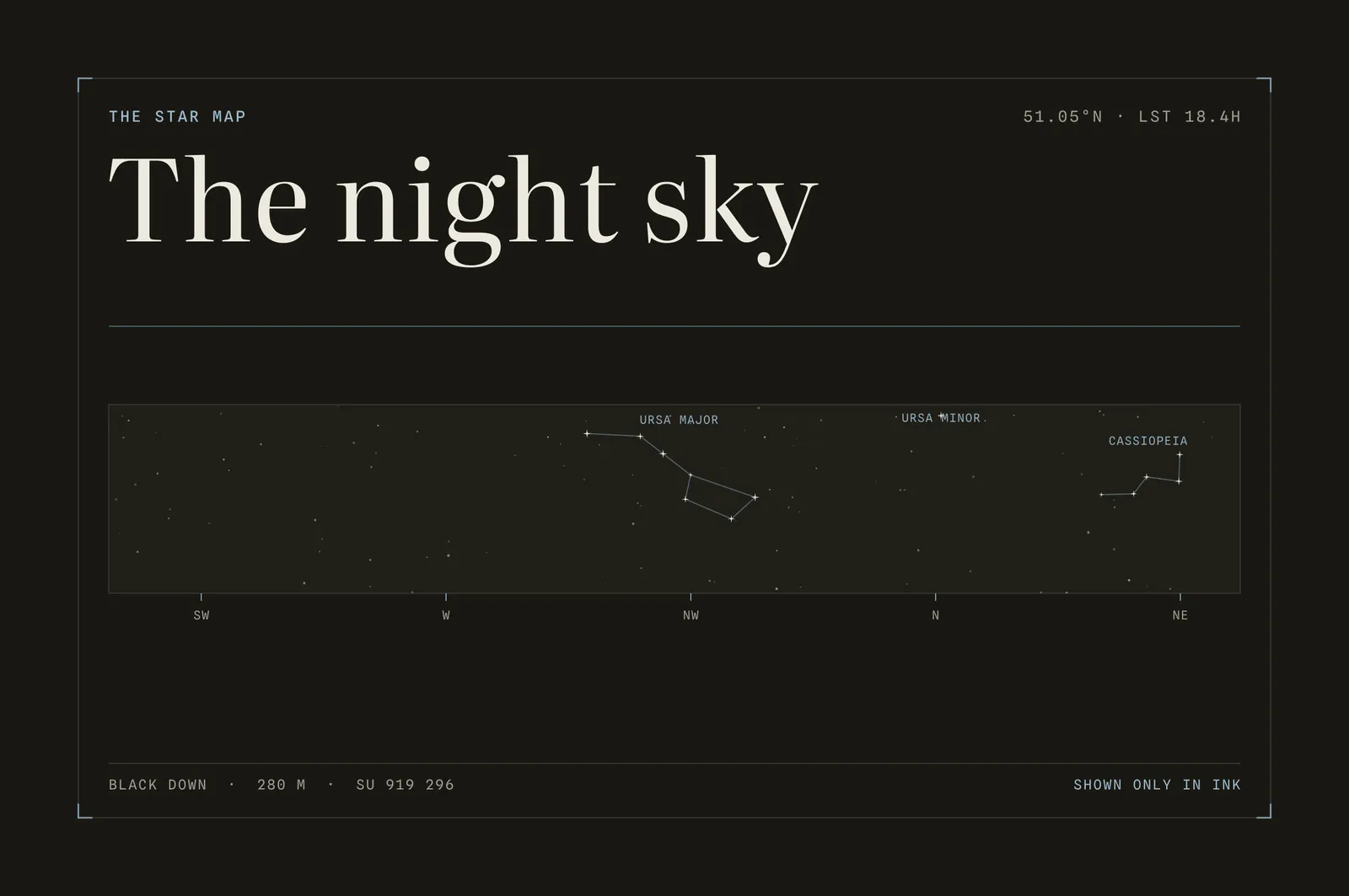
We toyed with adding clouds but everything felt a little twee, so we leaned into the whitespace in the Bone palette - less is so often more! The inky black however gave the opportunity for something special to fill that top of page gap. We are often found with our eyes peering down a telescope angled at the skies above us and wanted to project stars into the sky above Black Down too.
Not far from us is the Rolls-Royce Motor Cars factory where they’ve long been embedding the headliners of customer cars with ‘starscapes’, which gave us some inspiration. We sourced real data on stars and constellations that appear over Black Down from the Yale Bright Star catalogue to create an SVG projection that pans with the camera. You can see it on our homepage - switch to dark mode (top-right toggle) and scroll.
To talk to us about a design project for your business simply email us at rhianne@blackdownadvisory.com / charles@blackdownadvisory.com - and we’ll get back to you within two working days.