
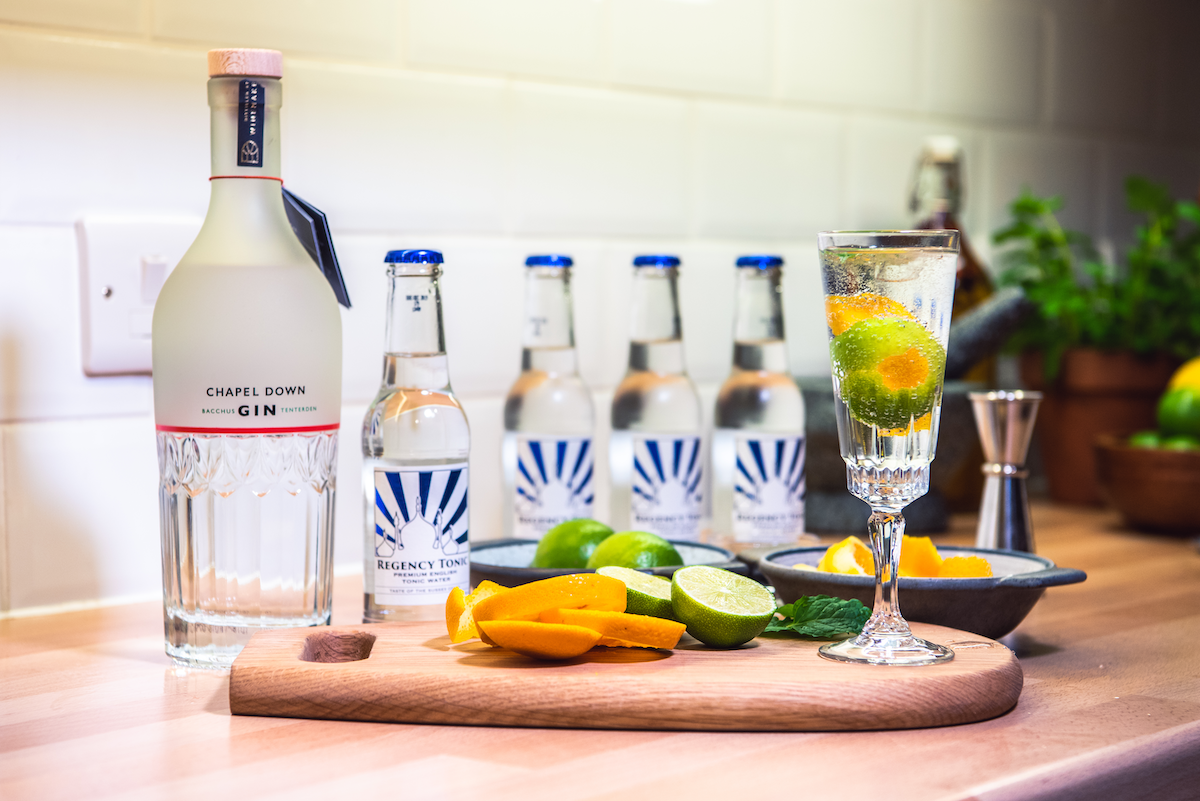
Iterative Design I: Brand and Product Design - Regency Tonic
“A child learns by making mistakes, I like to make my own. There is no learning without mistakes, and mature men are those who make them, recognise them and learn from them.” [Abram Games - Design by Naomi Games]
Design is creation with constraint and that’s a large part of what differentiates it from art. With design there are requirements to be adhered to, briefs to follow, customers to consider and budgets to stick to.
One of the first things we did as Regency Tonic was to commission artwork. We didn’t really know why, nor did we have a clear brief. We never found a use for these assets and in commercial terms it could be considered a frivolous waste of money a fledgling enterprise could ill-afford. We are however left with some beautiful works of art as a result - which have already outlasted the business!

The cinchona plant
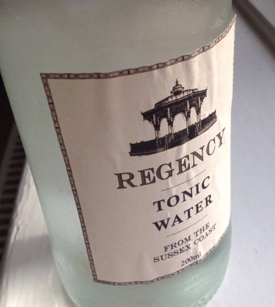
The bitter taste in tonic water comes from quinine extracted from the bark of the cinchona plant | Original artwork by Zoe Osborne.
My career before co-founding Regency Tonic had been spent entirely in the knowledge economy, dealing in presentations, reports and campaigns - few of which were ever digested beyond an LCD screen. I had never made anything - this was the first business I was involved in that made a physical product. Creating something tangible was a novelty; exciting, rewarding and challenging in equal measure. It drove home more than anything I’d done before that good design always seems to emerge as the result of an iterative process.
First impressions count
As a Fast Moving Consumer Good (FMCG) tonic water bottles would seldom be in people’s hands for long and few of them would be sober! Many of our customers would be handed half-empty bottles by bar staff or skim read the brand name on a menu. We had to design a product and build a brand (simultaneously and on a shoestring budget) that worked in both trade and retail settings - the ‘on-trade’ and ‘off-trade’ in drinks industry parlance.
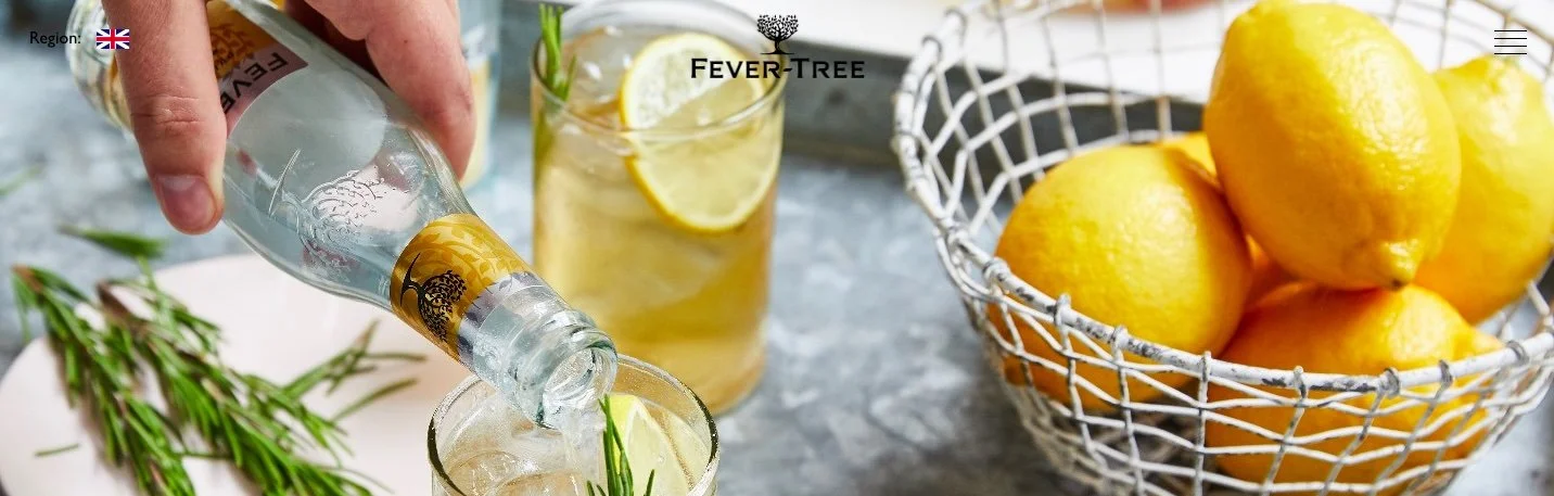
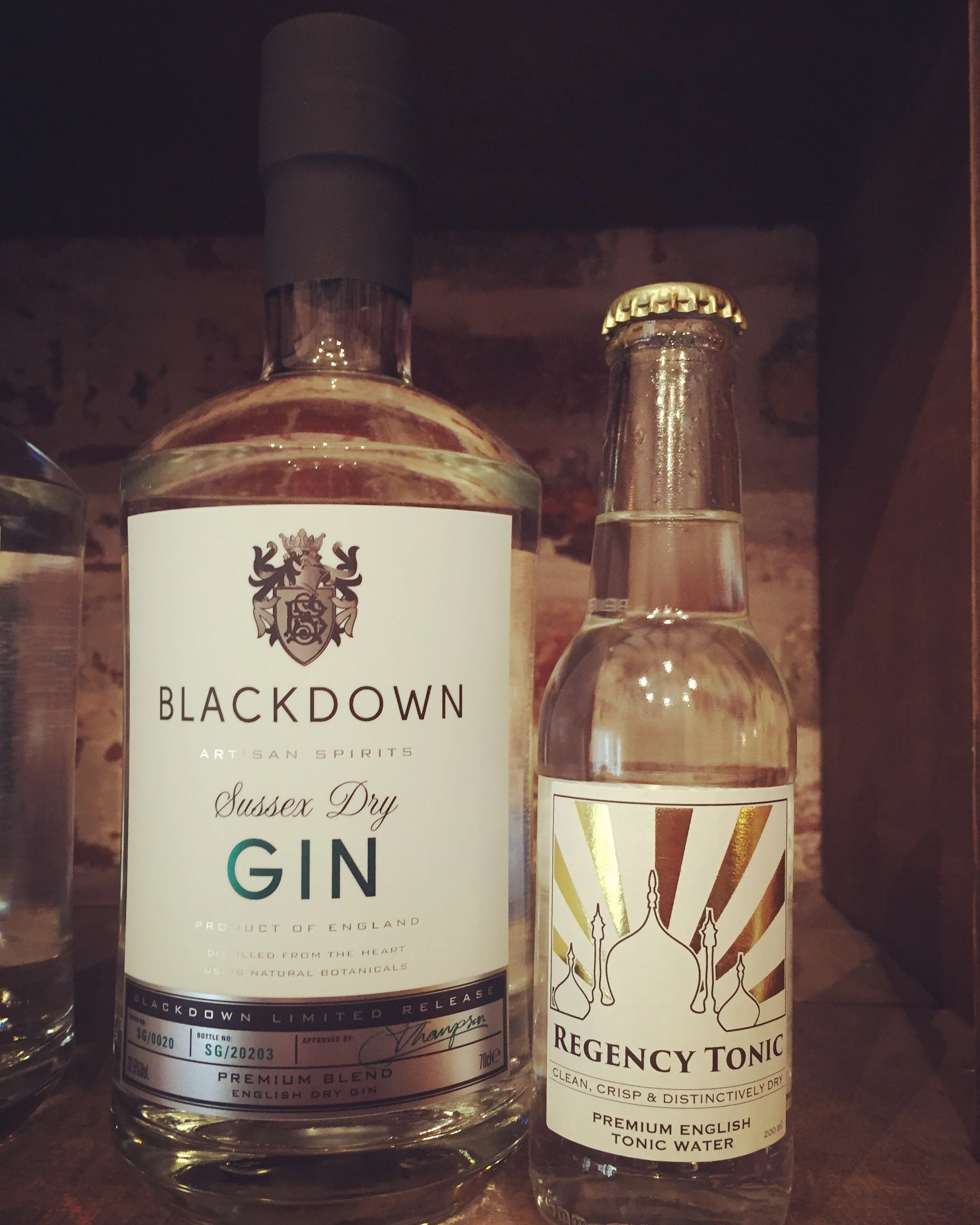
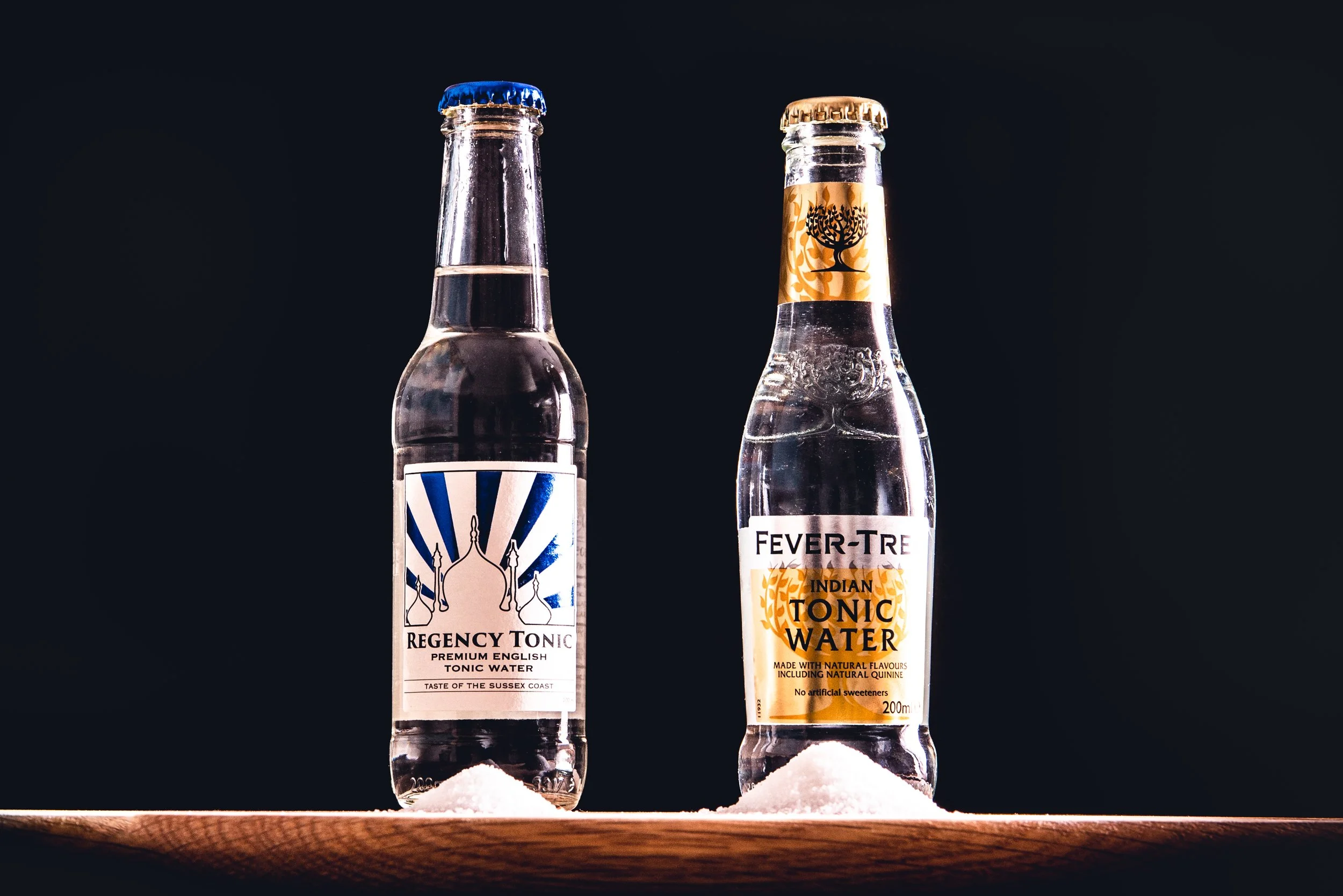
The opportunity we thought we’d spotted around 2015 was a boom in the premium spirits category, with particular growth in the UK and European gin markets. The corresponding mixer category had been slow to follow the premium trend, with only one major player - FeverTree - who as of November 2014 were a publicly listed company and rapidly expanding internationally. Might they have a blindspot at home?
Positioning our brand in the mixer market
A £93m IPO fed FeverTree with capital and us with information - we scrutinised their public reporting in an attempt to derive valuable insights. Their production model was entirely outsourced - they weren’t ever touching their own product. Ingredients were delivered to contract bottlers, FT HQ managed the brand and an army of sales people and brand partnerships activated trade and retail customers. Their onboarding process largely involved lavishing new trade customers with heavily discounted / free product plus a plethora of branded barware and accessories. We’d attempt to do something similar, with just a few thousand pounds and whatever was left from our paycheques each month!
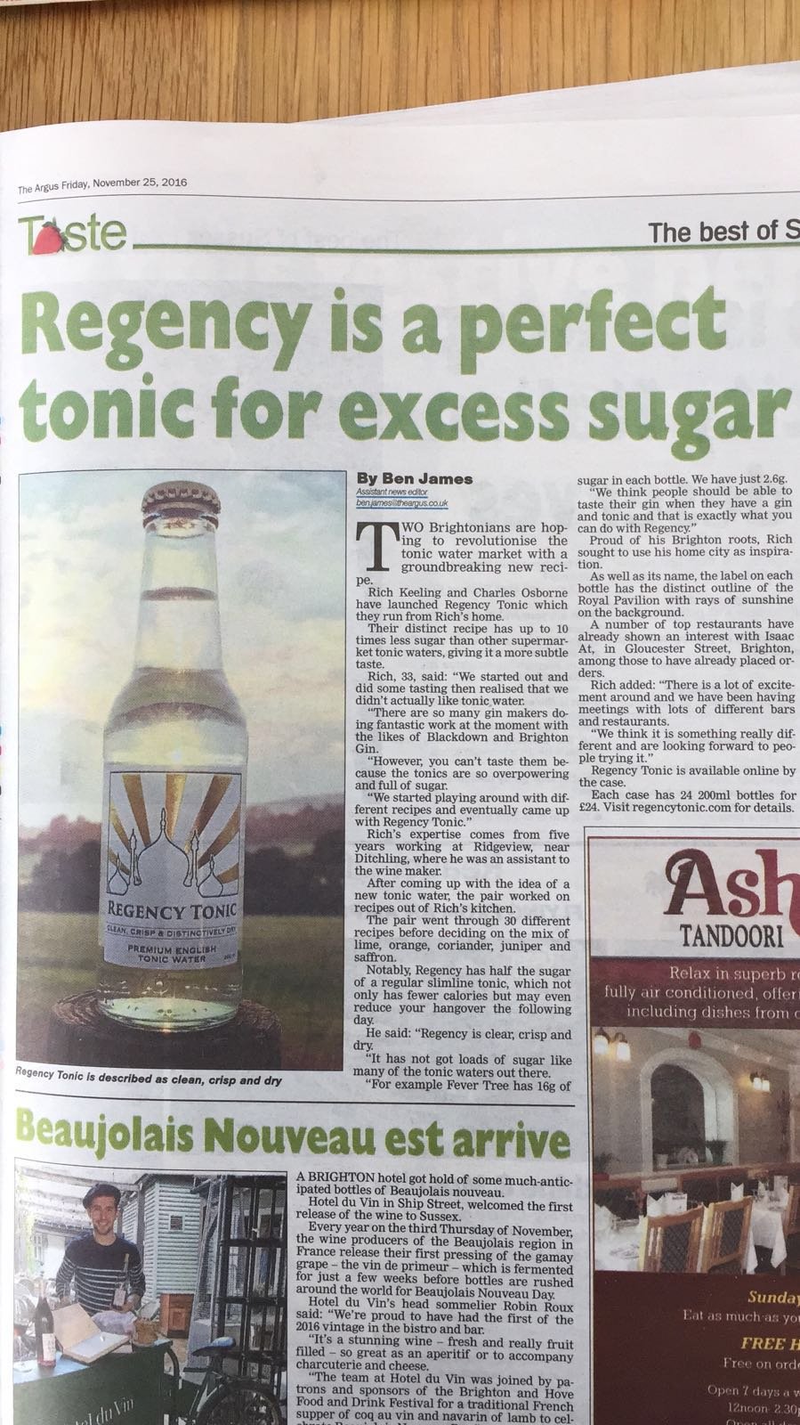
Our differentiator? Less sugar. At the time even FeverTree’s healthiest mixers contained almost as much sugar per 100ml as a bottle of Coca-Cola. They were expanding their range laterally at pace too, with ever more exotically flavoured tonic waters that increasingly resembled more traditional sugary soft drinks but with more upmarket branding. We thought the market might just move in the opposite direction.
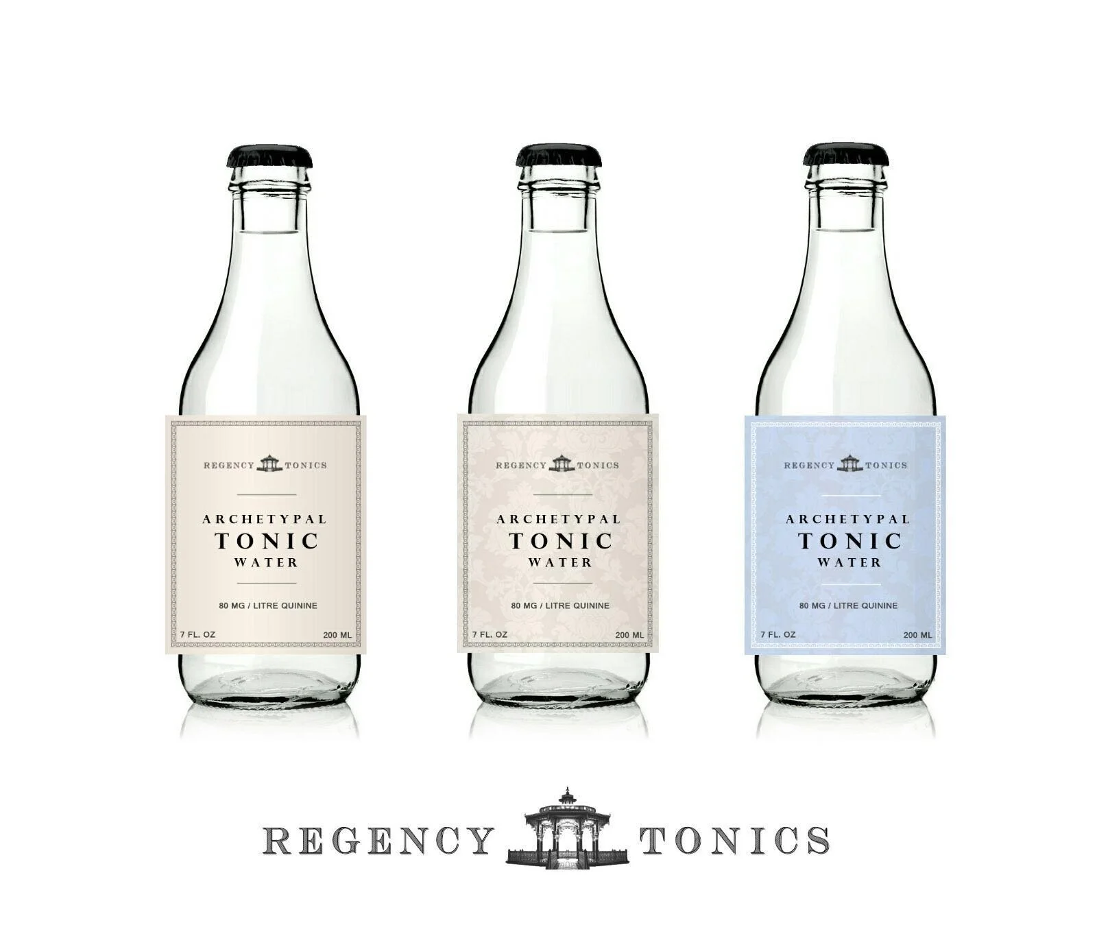
Minimalist mixers, minus (most of) the sugar
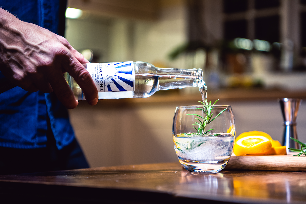
We planned to make more minimalist mixers - carbonated tonic waters that took a backseat to the spirits they were mixed with.
As the market grew, subtler spirits were being distilled with increasingly delicate and complex flavour profiles. We thought these sophisticated spirits deserved a healthier, cleaner tasting accompaniment; a tonic water containing as little sugar as possible, so drinkers could actually taste the gin in their G&Ts. There was a growing backlash against high sugar consumption brewing too (c. 2015) as consumers and governments were becoming more conscious of the negative health impacts of sugar.
We targeted the top of the market - super premium - theorising it would support high margins. We’d need these to reinvest and build the business as we didn’t have external capital to scale production to the levels needed to be price competitive in a high volume segment. The brand and packaging needed to live up to this luxury marque ambition.
Naivety might be…necessary?
At the outset of any business you’re largely driven by naivety and ambition. You have to be convinced of your own market thesis, to wholeheartedly believe in the superiority of your product - often before it exists! Or at the very least in your ability to create something that’s demonstrably better than what’s already out there.
This delusion might be as necessary an ingredient for a new venture as a good idea. Without it few rational people would ever start a company, the odds being so stacked against your success.
In the beginning was the worst, and the worst was not good. Here’s a glimpse at how we iterated our way…
…from this…
…to this:

The Ginesis of a tonic brand
Regency Tonic was a side hustle for me and a friend alongside full-time jobs (in vintage aviation and the wine industry respectively) . Not ideal, but situations seldom are. We were always severely cash and time constrained. In hindsight these constraints can be helpful; it’s often from limitations that the most innovative ideas emerge.
Before diving into the different iterations of the brand and product design, a few notes:
We have no formal training or qualifications - we’re entirely self-taught and don’t pretend to be experts at…well, anything really
Things don’t always go well; collaborate with good people and treat each other well - this (failed) business remains the foundation of a great friendship
Creating things is much more rewarding than being a critic on the sidelines - try it!
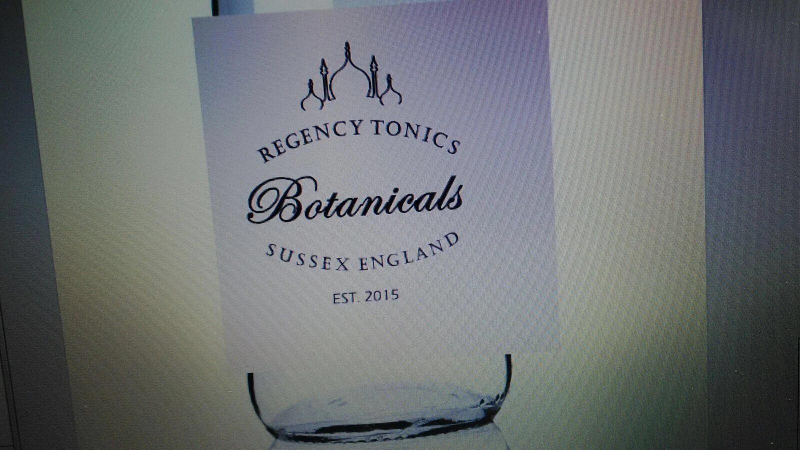
What’s in a name?
We both lived in Brighton & Hove when we started the business. I don’t recall how we landed on ‘Regency Tonic’, but it worked. The C.19th saw George IV (then Prince Regent) commission the construction of Brighton’s famous Royal Pavilion. Around the same time the gin and tonic came into being, helping quench the thirsts of British military officers in India - gin masking the unpleasant bitterness of their antimalarial quinine rations.
Regency Tonic then - rooted in Brighton’s heritage, harking back to Britain’s Imperial past. How should it look?
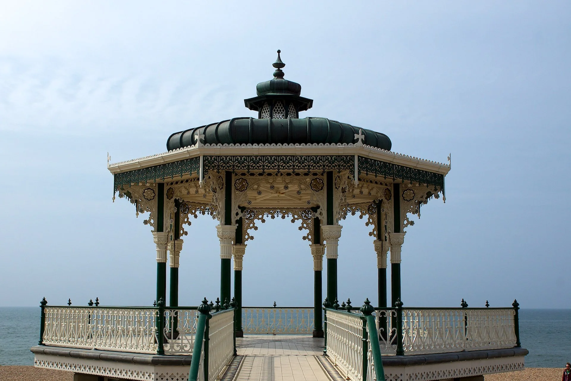
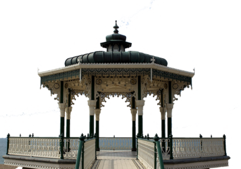
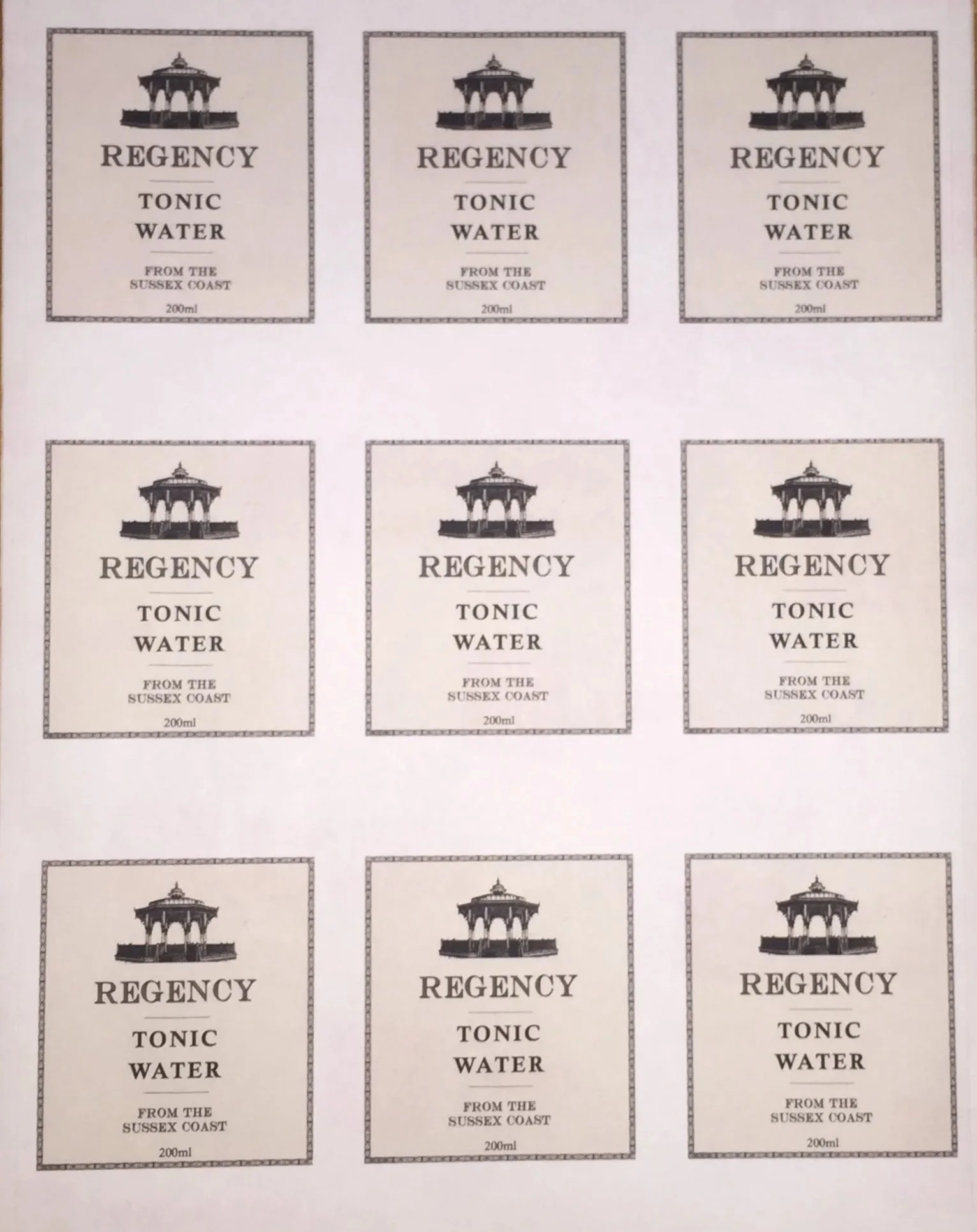
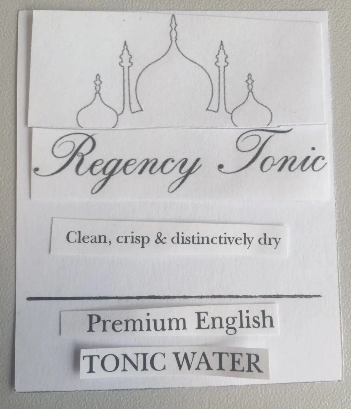
Version 0.1 - iconic Brighton architecture - the bandstand. Just a few hundred yards from my flat at the time was a restored C.19th bandstand on Hove seafront. We thought it looked suitably of the period (it’s actually several decades too new to be Regency, but who’s counting?!). We picked a suitably spiffy serif font that we thought matched it well. Regency Tonic brand / logo v0.1:


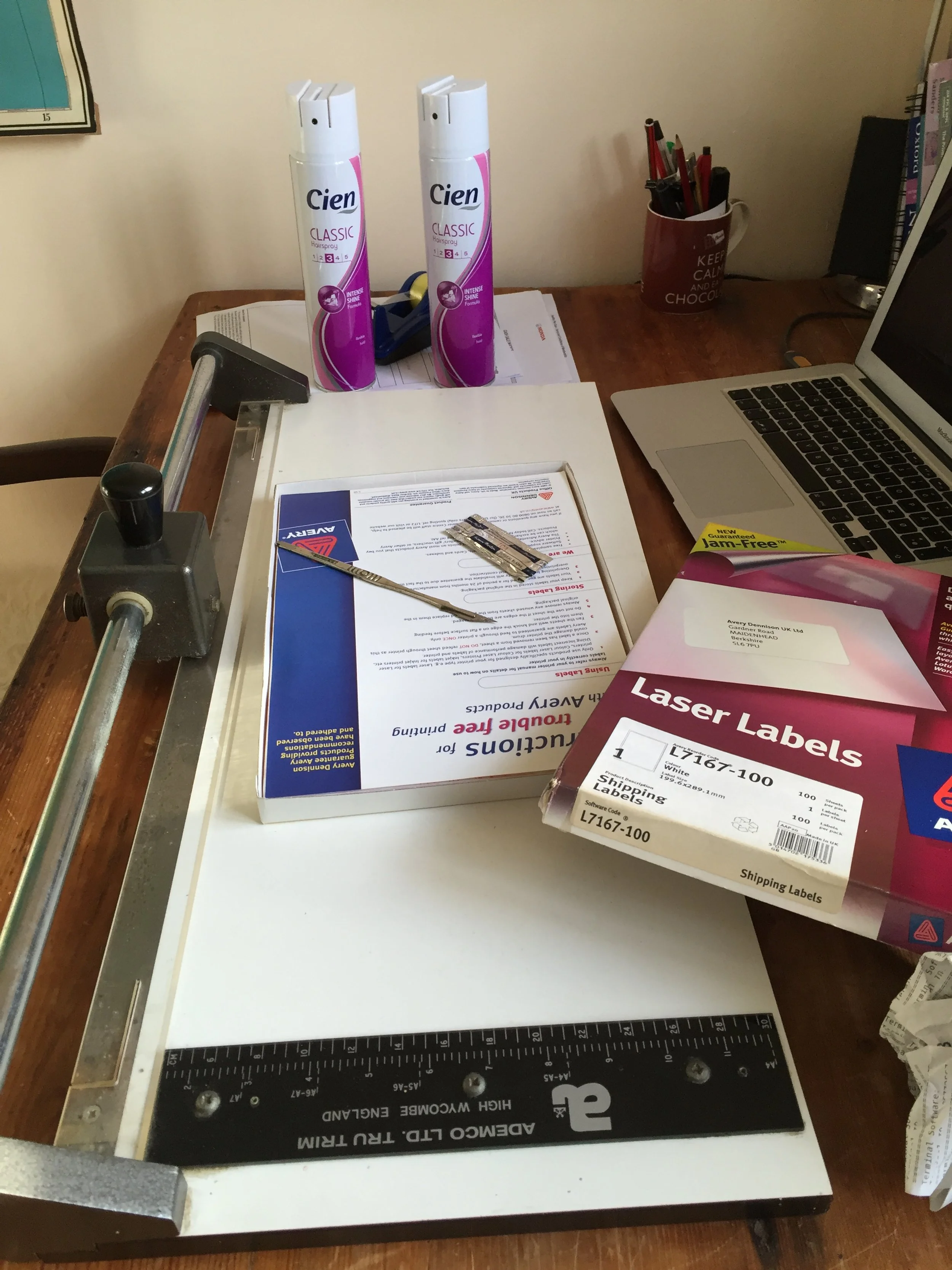
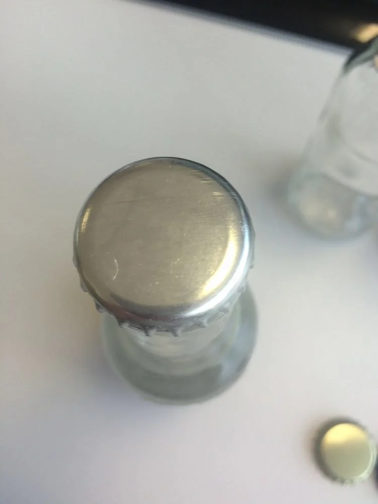
A few minutes with InDesign, an inkjet printer, some Avery labels, hairspray to fix the ink from condensation in the fridge and a crown capping press to put tops on the bottles we’d sterilised in the oven - how hard can this drinks business really be? We soon had our first front label design! 🫣
Here’s one of our first ‘product shots’. We threw it up on social media and expected the product to fly off the shelves. LinkedIn Reid Hoffman’s famous quote springs to mind:
“If you’re not embarrassed by the first version of your product, you’ve launched too late” [Reid Hoffman]
Time to find out if this sage Silicon Valley wisdom applies in the real world…
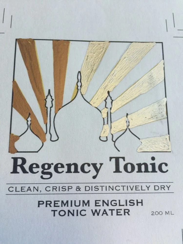
Regency Tonic v0.1
Not (yet) a ‘super premium’ product!
It turns out you can’t just make food and drink in your kitchen and sell it to the public, so before we got into trouble (or hurt anyone!) we sought out a production partner who had a facility with the relevant health and safety certificates - this was FeverTree’s outsourced production strategy at nano scale.
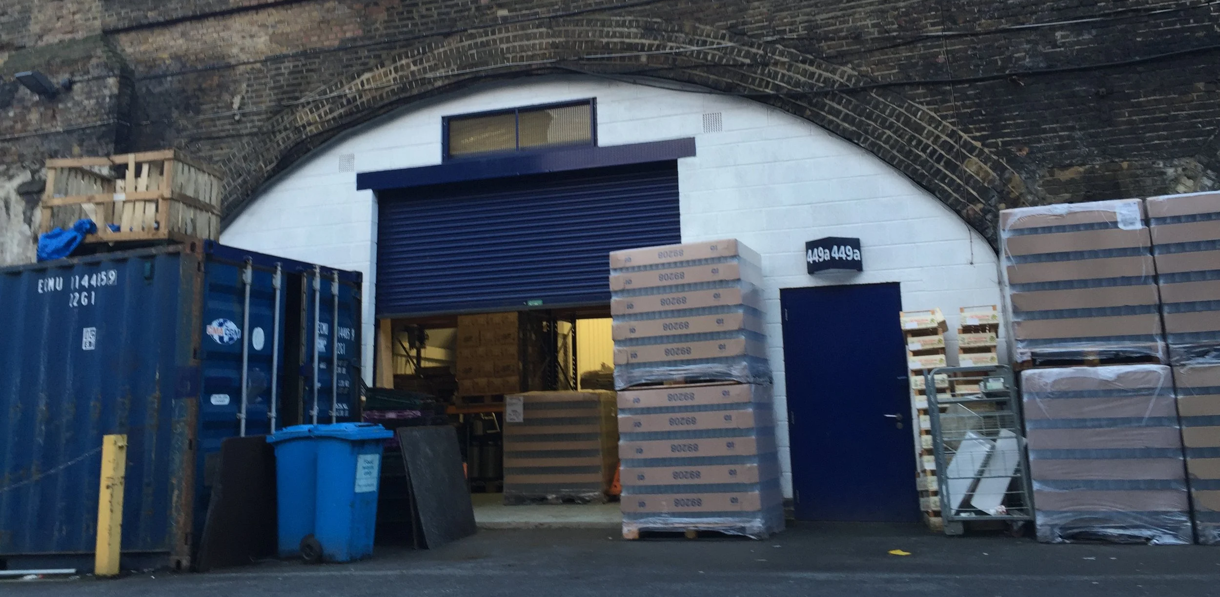
We found a juice company with a modest bottling facility under a railway arch in London who’d bottle a run for us at a price we could afford to pay. Crucially they had a pasteuriser, which would help make sure we didn’t kill our customers.
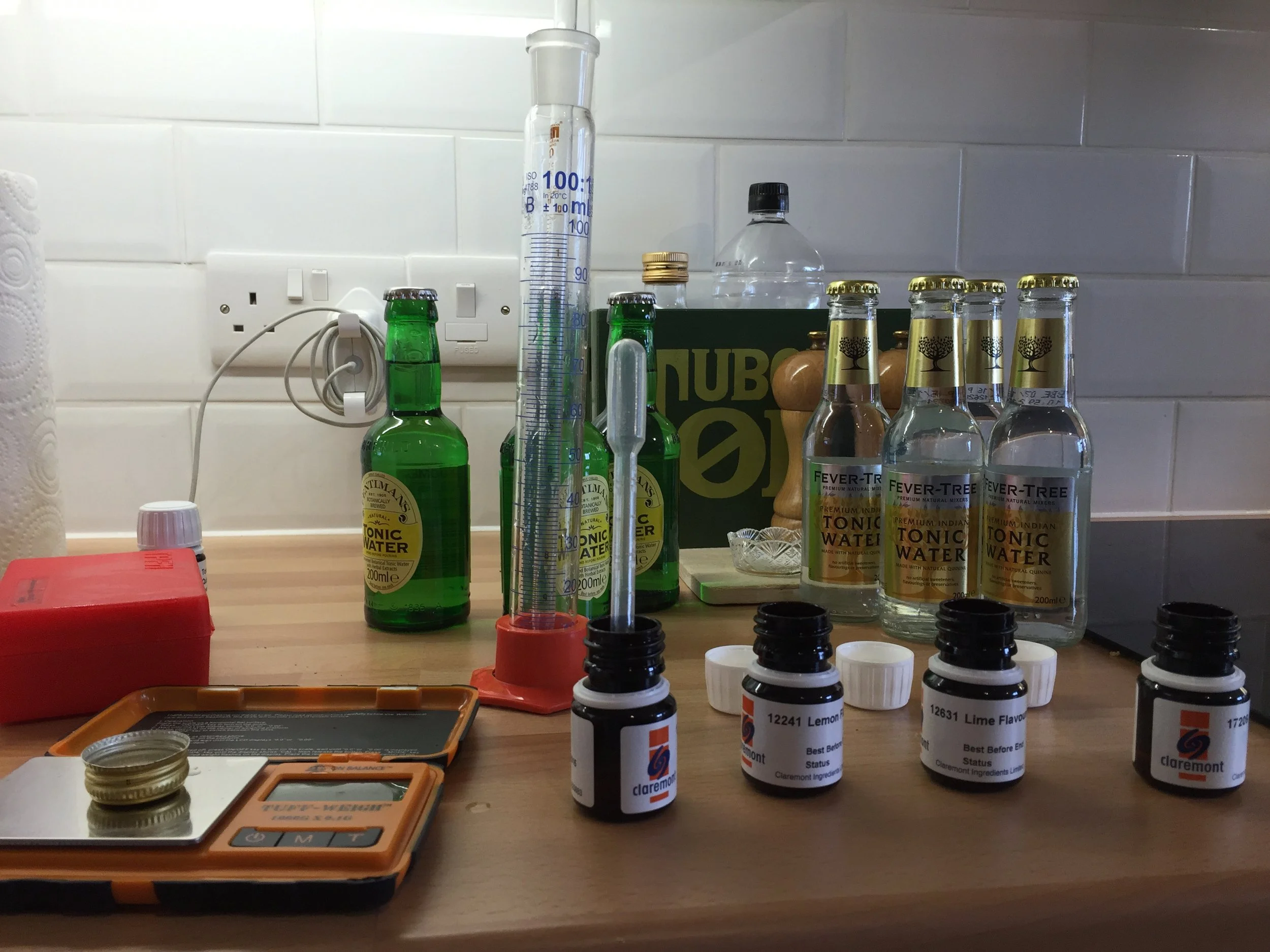
We’d gone through dozens of recipes in our kitchens, steeping ingredients, carbonating with a Sodastream machine - whatever we could think of.
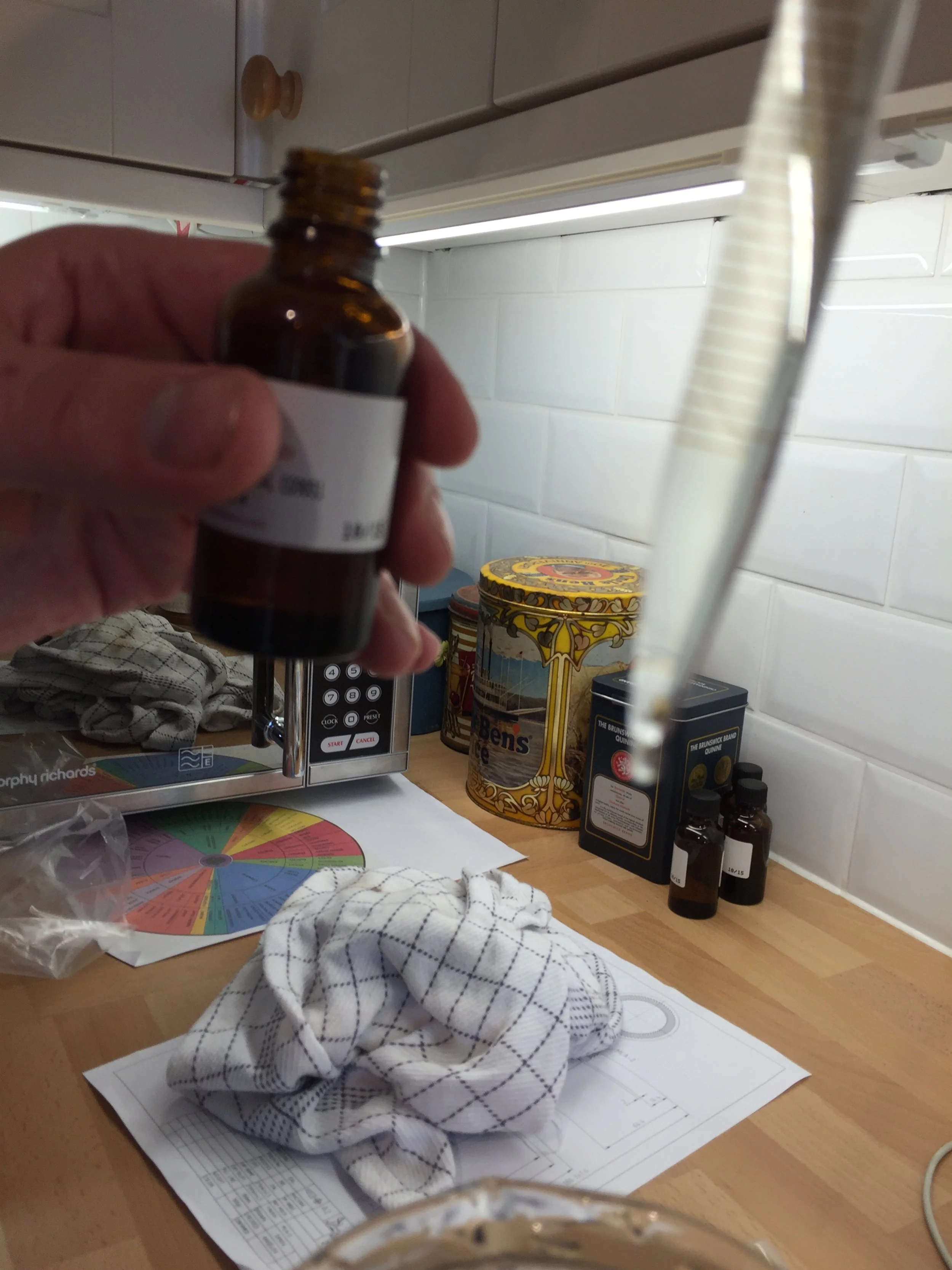
We taste tested every tonic water we could find, noted what we liked and disliked and set about crafting our own tonic water recipe. One of tonic’s key ingredients - quinine - proved something of a problem. We aborted efforts to procure the raw bark in large quantities via a friend in Medellin, Colombia and instead sourced a food grade product from a food ingredients supplier in Germany, at eye-watering expense.
There are only so many problems you can solve at once in a startup. Dealing with wholesale markets in the tropical territories quinine typically grows seemed like a wise one to avoid in the company’s inception phase.

I’d never seen drinks commercially bottled before - at any scale - and have always been fascinated with how things are made, so really enjoyed the experience of our first bottling run. In hindsight these guys did a better job for us than any of the bigger players we’d meet and work with down the line, and I wish we’d stuck with them for longer. I’m sad to see that they too appear to have gone out of business.
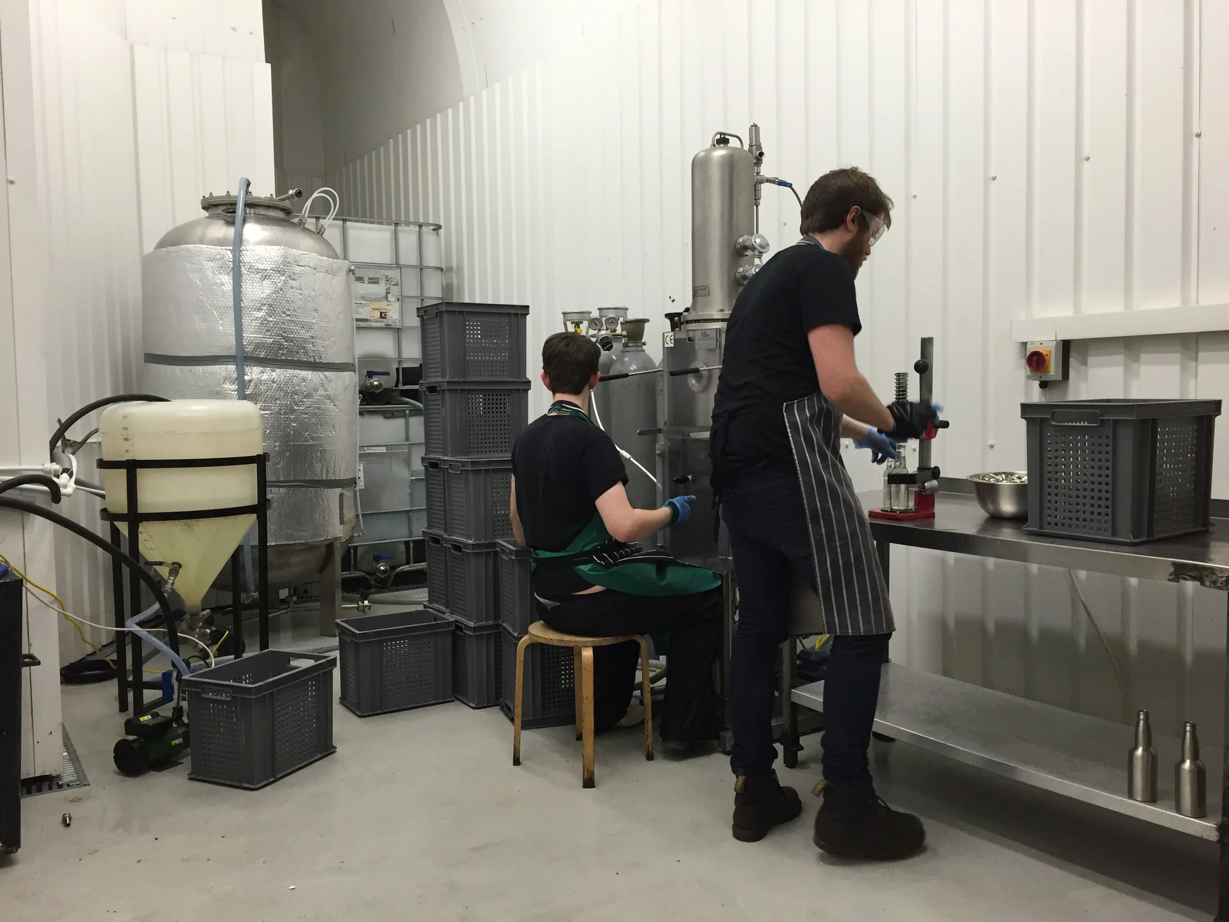
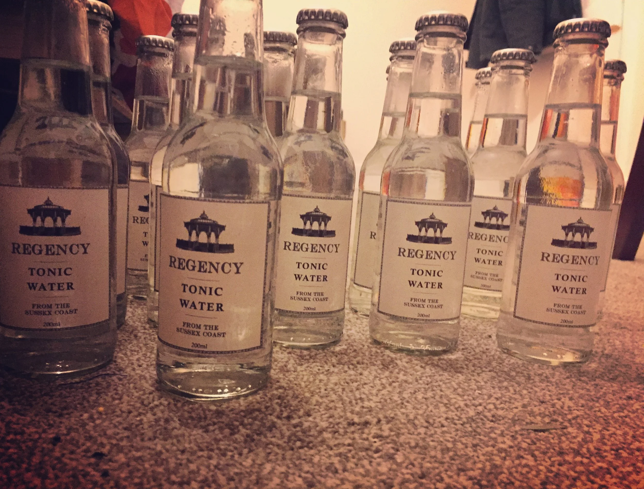
The first ever commercial batch of Regency Tonic is bottled. They might only be carbonating two bottles at a time, but at least they were carbonating them properly. More on that later…
A lesson learned the very hard way; when you find honest people who do a job well, invest in them and build the relationship before looking further afield. This small operation turned out to be the only place that ever properly carbonated a batch of tonic water for us. Far bigger bottling plants would later almost kill the business through their inability to do something as simple as properly putting bubbles into our drinks.
Maybe if we’d stuck with these guys both their business and ours could have grown together?
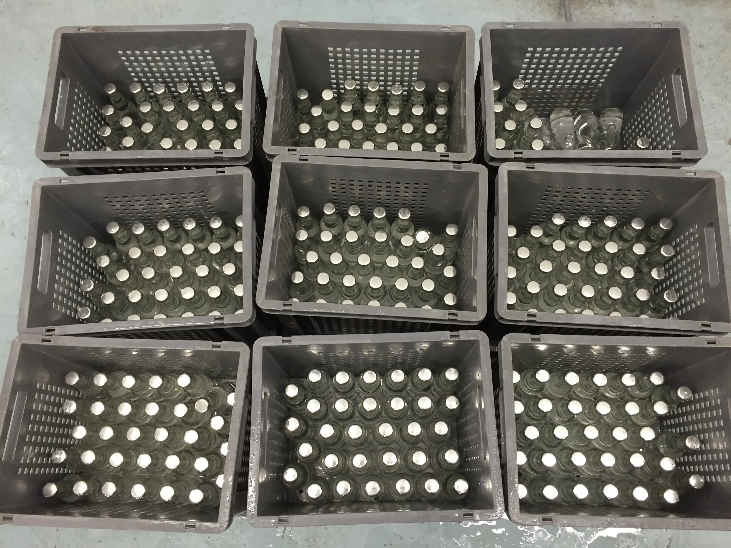
Regency Tonic - Batch One - fresh out of the pasteuriser.
Our first batch of tonic water had been produced, now we just had to work out how to sell the stuff! A decade ago it wasn’t quite as easy as throwing a picture or two up on social media and waiting for the orders to roll in, but we’d sort of hoped it would work out that way. It was far less of a fight for attention online as it is today, that’s for sure.
We knew enough people that drunk gin, had a few friends in the pub trade, some drinks industry contacts and gin was *booming* in Britain - this felt like an open goal.
Working the Problem(s)
A friend’s pub took a case of 24 x bottles. Most of them sat unsold for months whilst Schweppes flew off the shelves. We had some positive feedback from others and sold a handful here and there and were hand delivering orders ourselves.
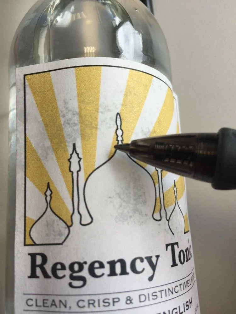
However we had a label problem. We knew the design was sub-standard and were already planning to roll the revenue from this batch into smartening things up, but a few hours in a fridge and every bottle looked like this:
Label quality problems
Don’t believe everything you read on the internet - hairspray and inkjet paper do not make for good labels! 😂
We worked through many designs for the brand and labels at this point, entertaining some rather left field ideas, wasting money commissioning more local artists (one of the best ways to ‘waste’ money in my opinion) to draw us things like this quaint bathing machine:
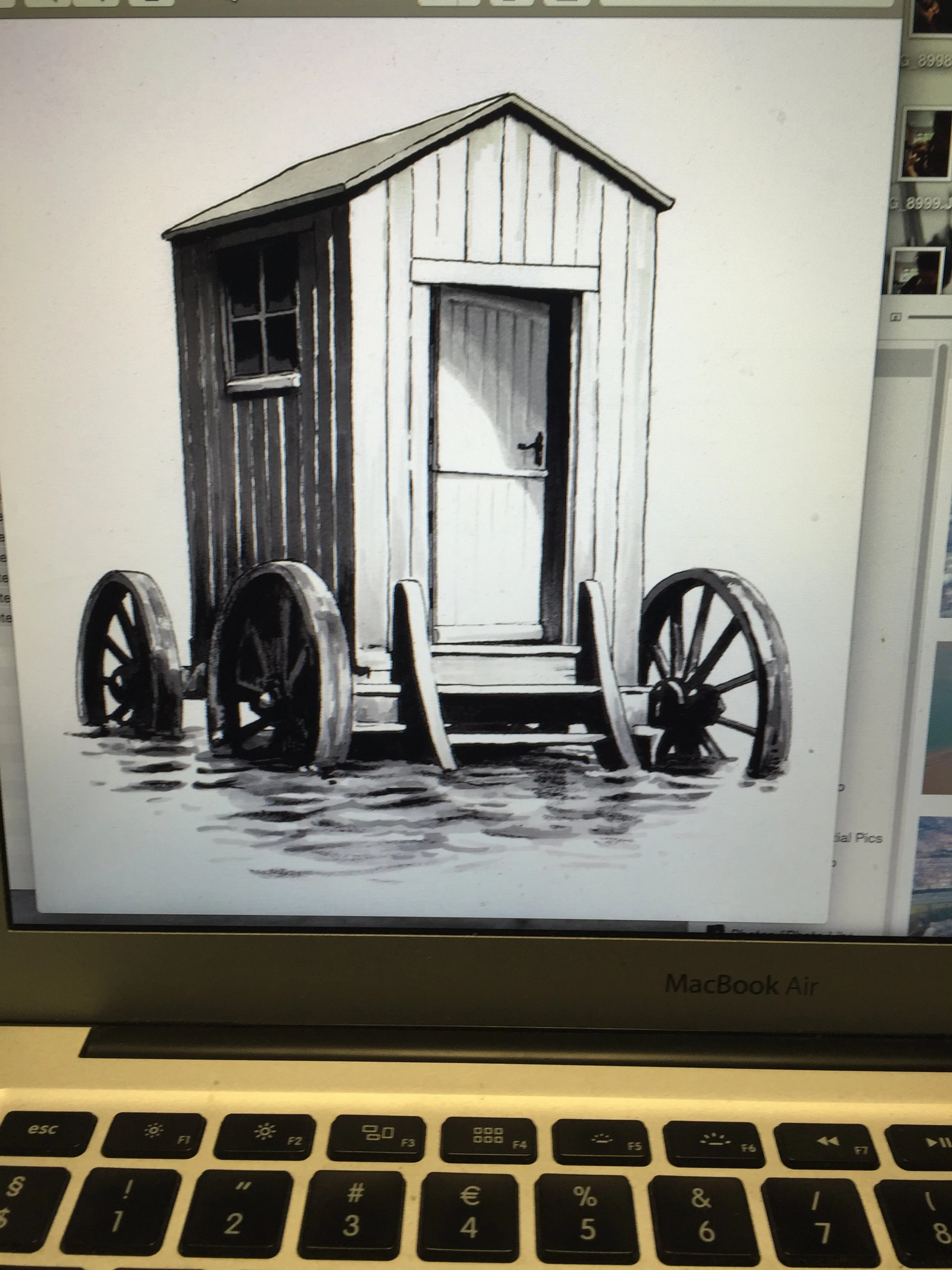
A bathing machine
I thought it looked like a public toilet…
Back to the drawing board. What’s synonymous with luxury and decadence?
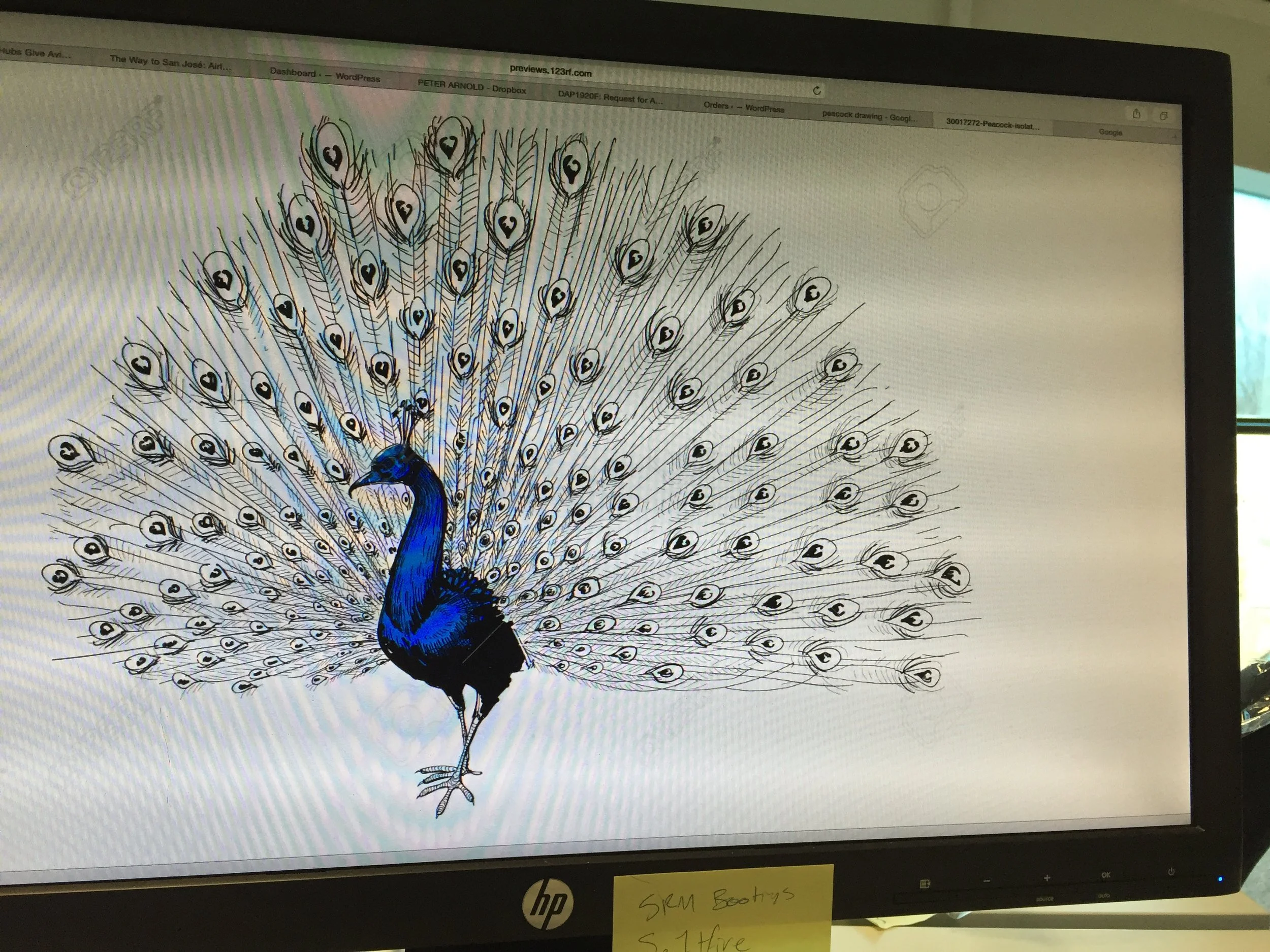
A peacock of course!
Lovely, but what on earth does it have to do with tonic water or Brighton?
“Can you make it more Brighton?”
See my earlier note re: 'having a clear brief…
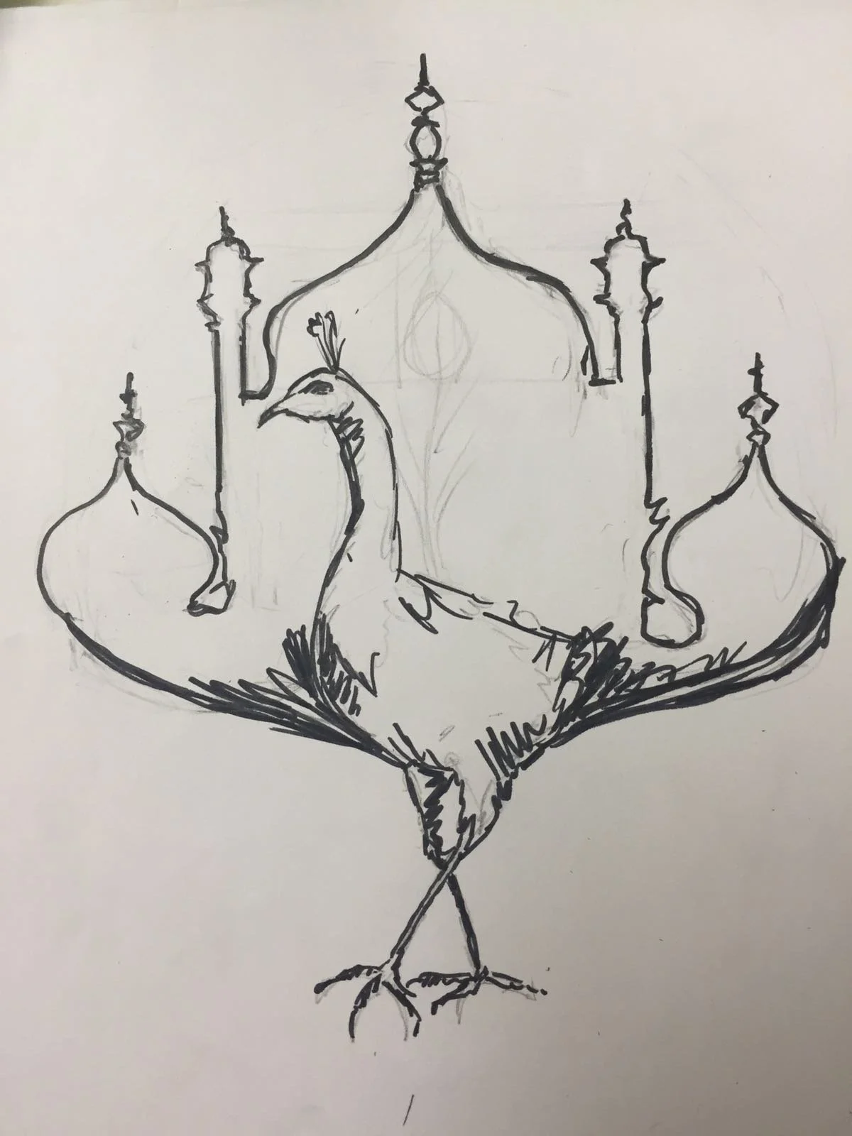
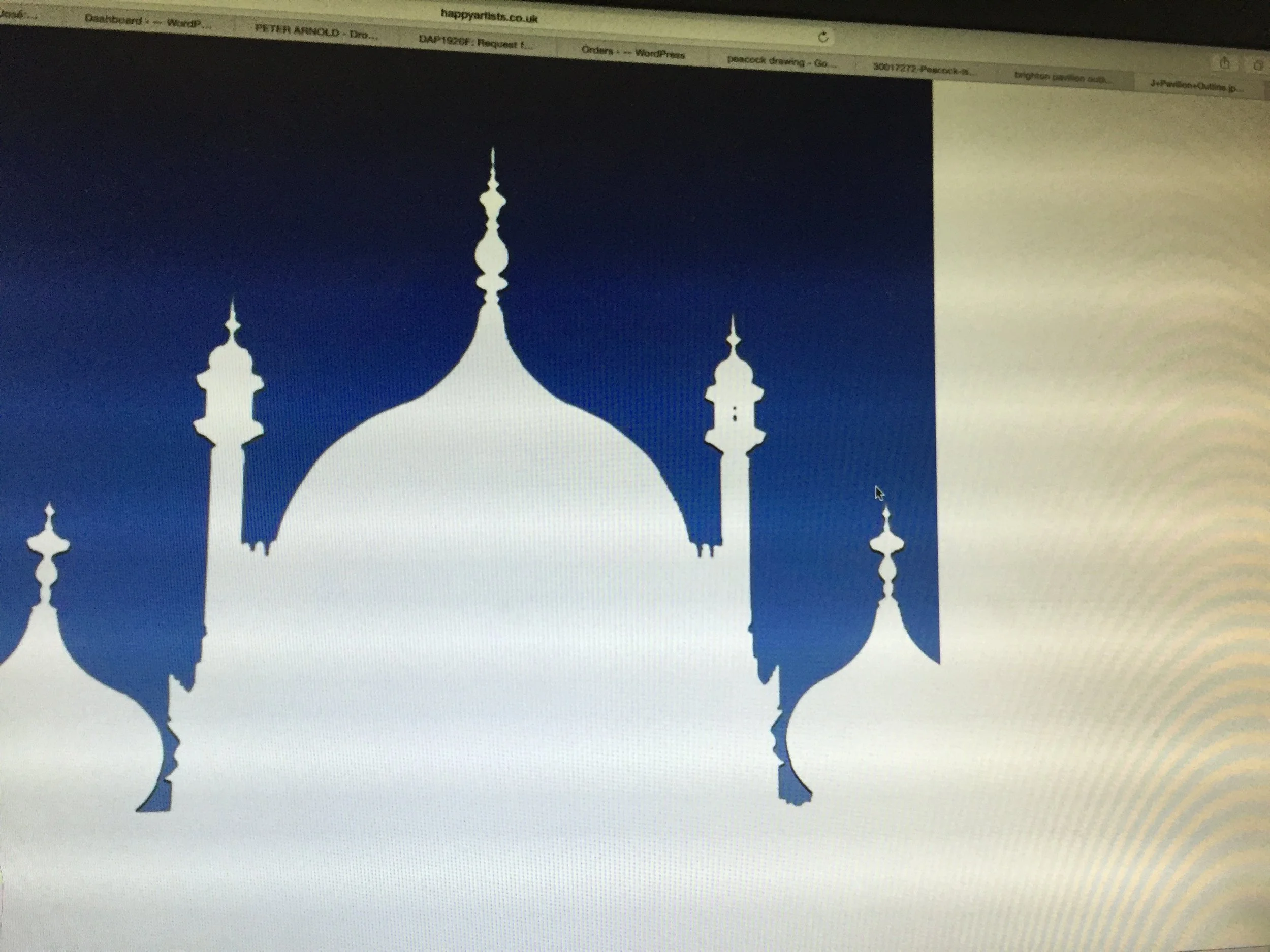
An unmistakably Brightonian peacock
This somewhat surreal doodle ended up leading us in an excellent design direction - you never know where the good ideas will come from.
Very Salvador Dali but perhaps a bit too leftfield, even for a brand from bohemian Brighton. We’d avoided the Royal Pavilion up until this point because it reminded us of Brighton & Hove City Council’s corporate identity. Provincial government vibes weren’t really what we were after…
Brighton & Hove City Council logo
Are we chasing provincial government vibes here?
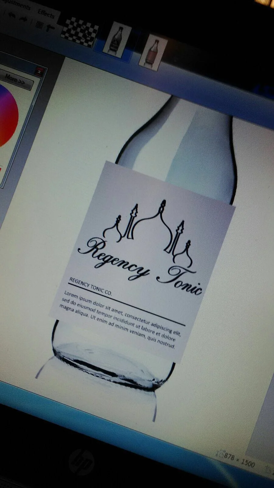
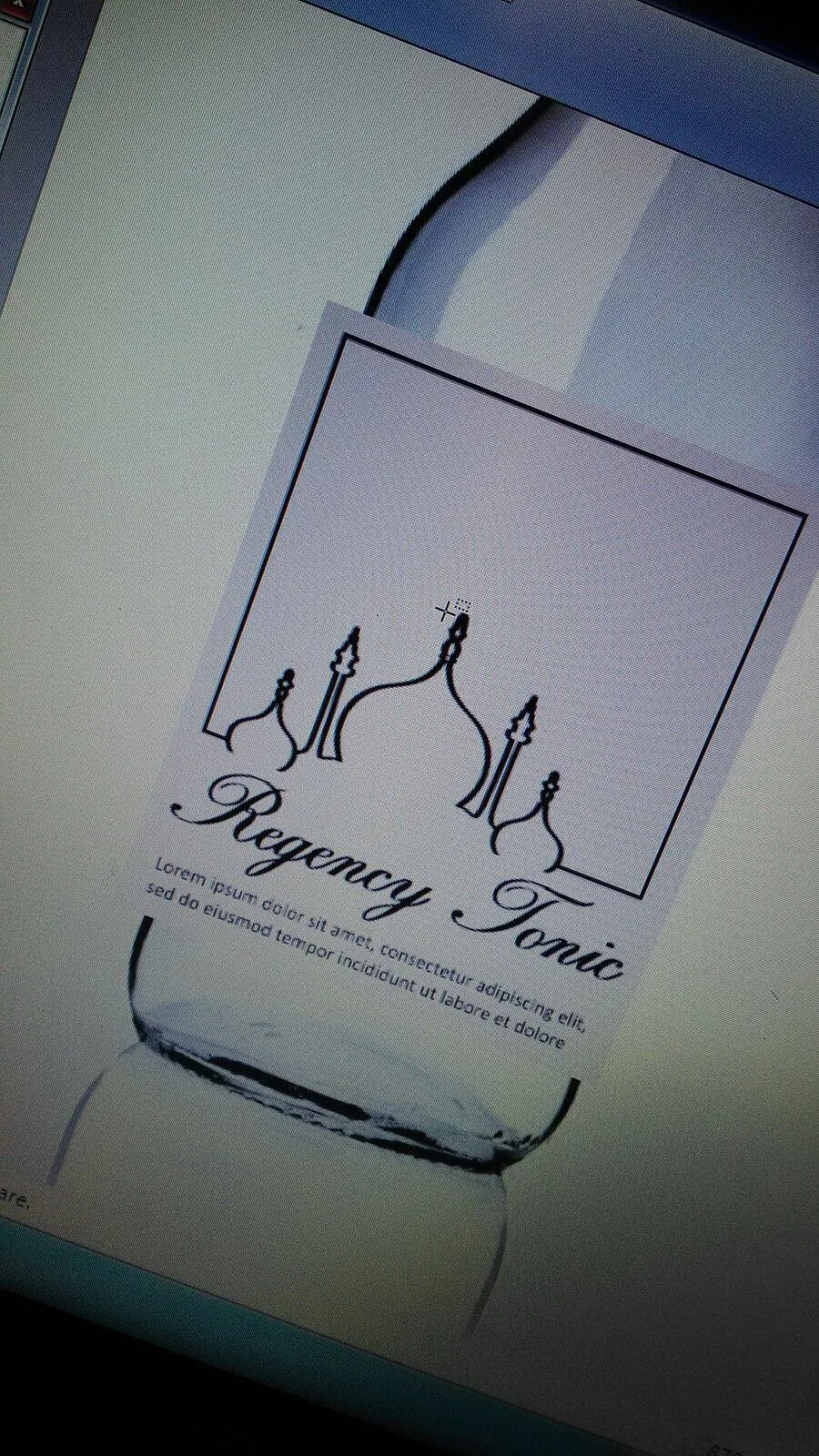
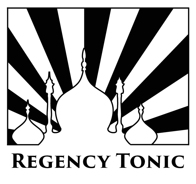
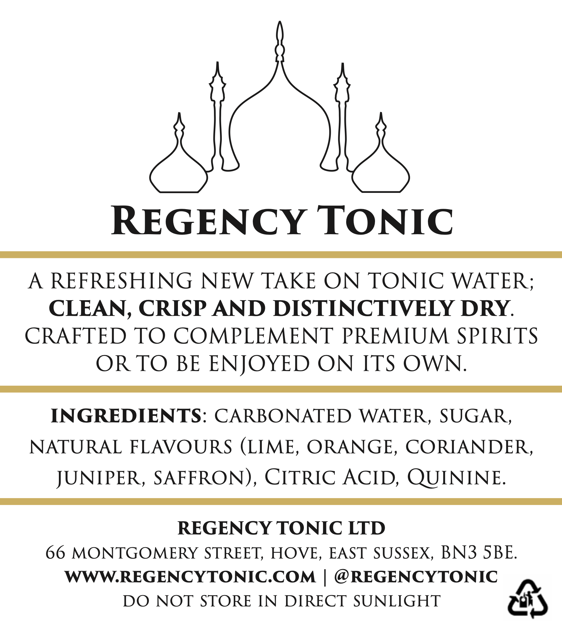
There was something here however. Not only was the pavilion unmistakably Brightonian but the Taj Mahal inspired architecture seemed to hark back to an era of Empire that struck a chord with the history of the G&T itself. It was an identity that might just work both in the short-term in our hometown, and resonate further afield (if handled with tact). We already had fledgling plans for our first entering our first export markets. Back in the real world we (Richard, my sister and I) were furiously sketching Brighton Pavilion on every piece of paper and screen we could get our hands on:
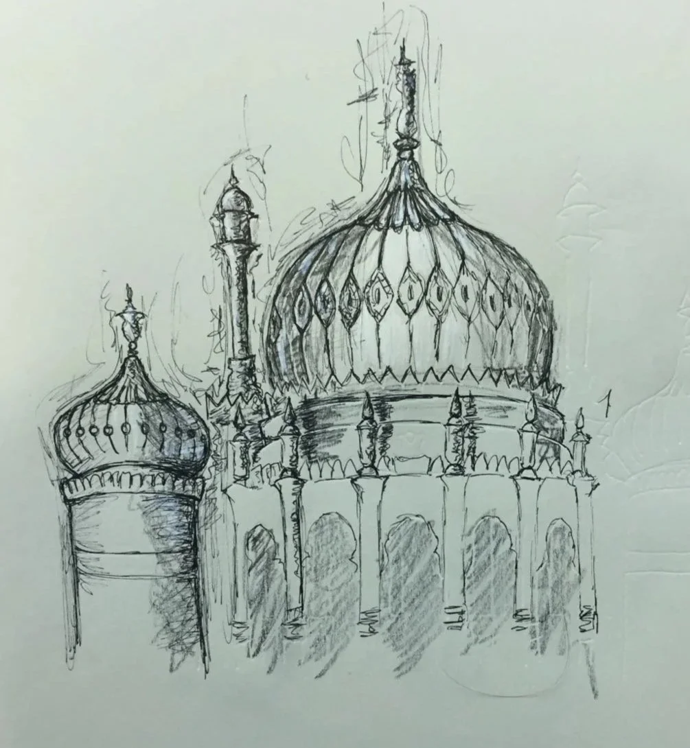
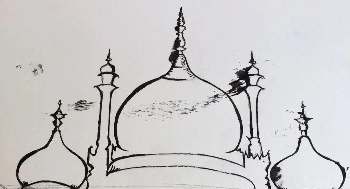
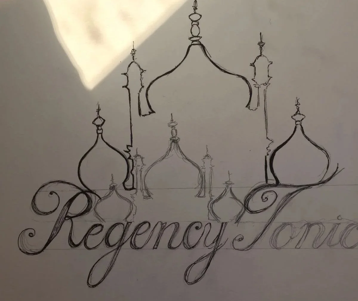
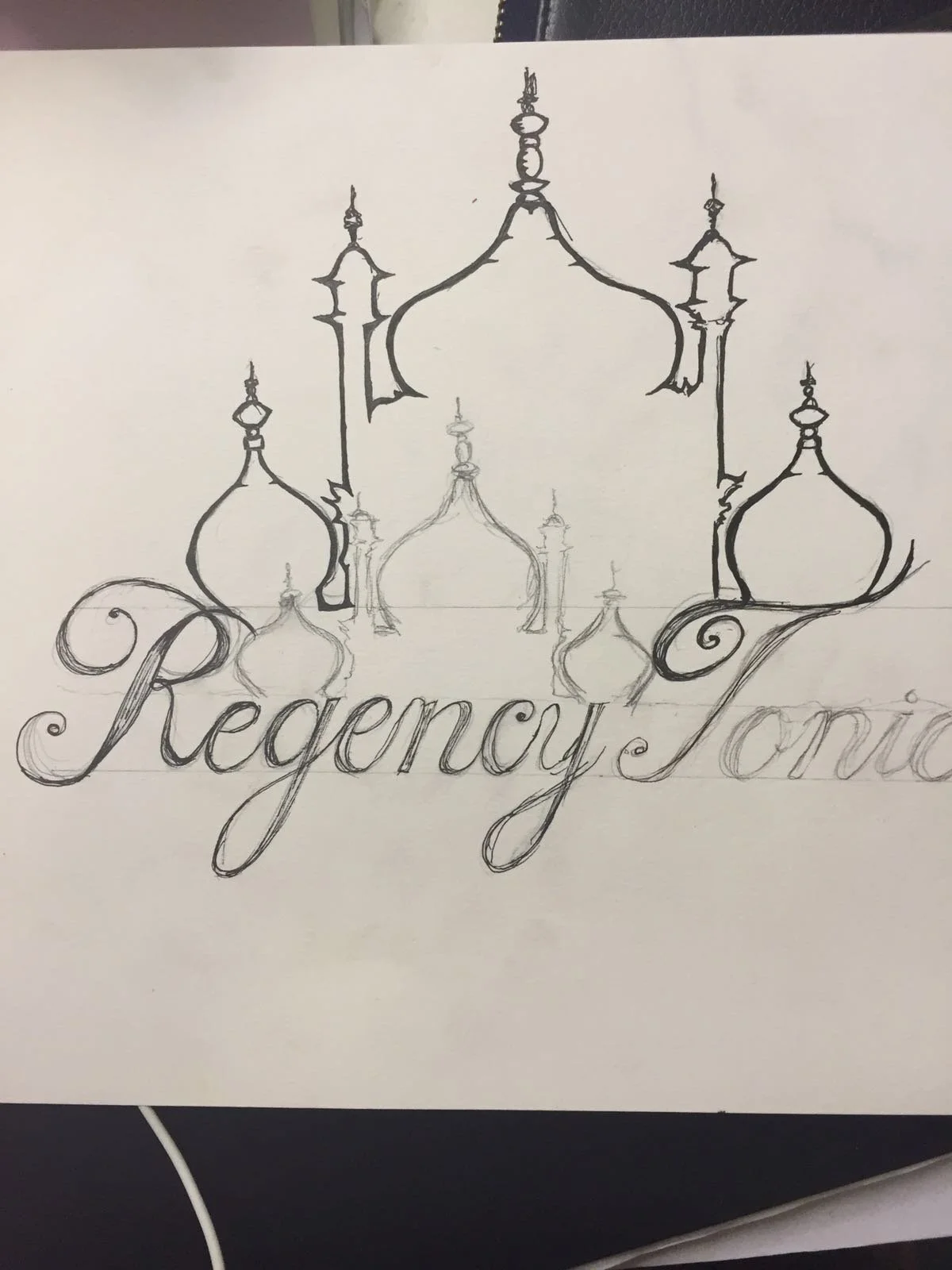
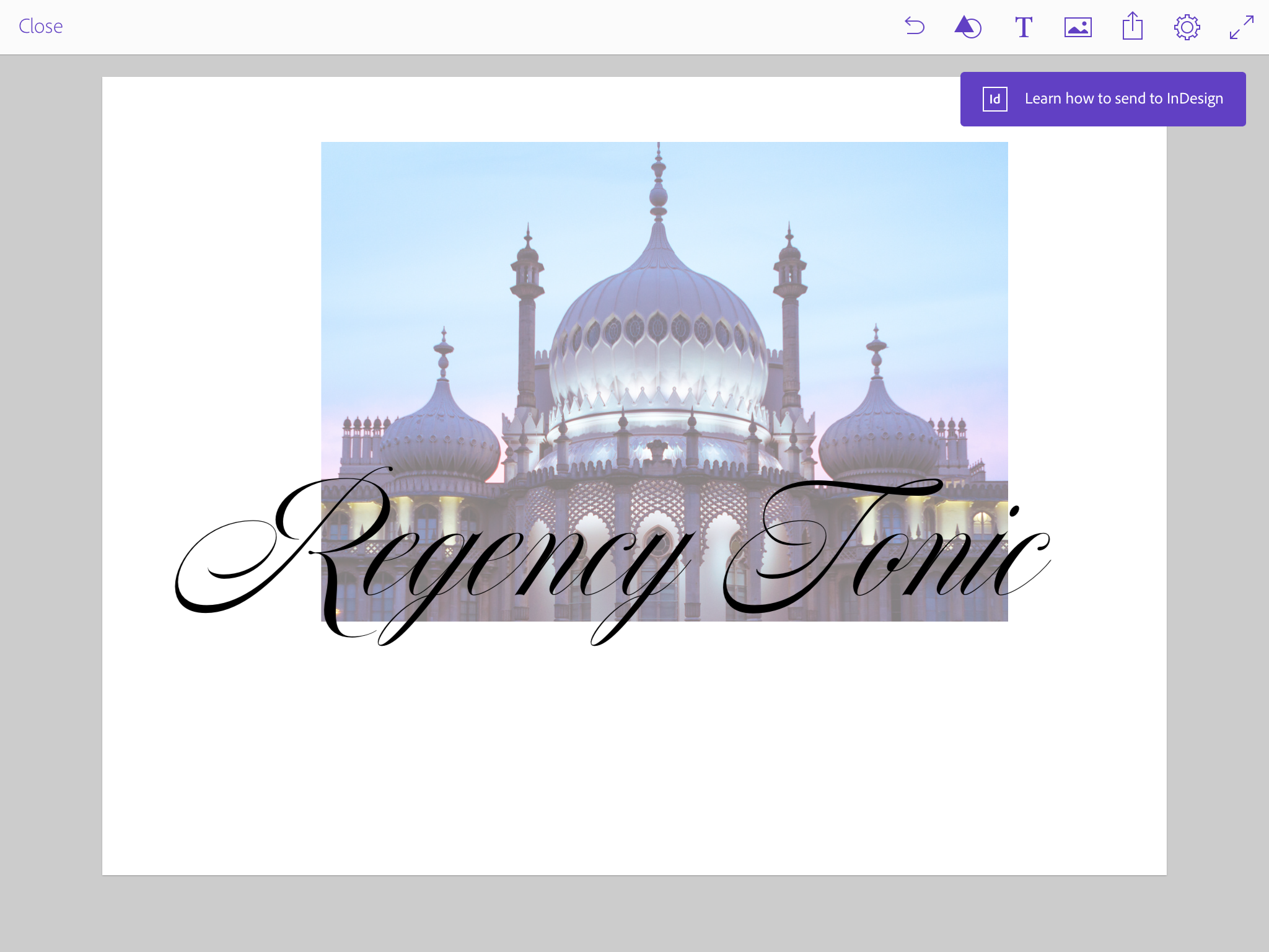
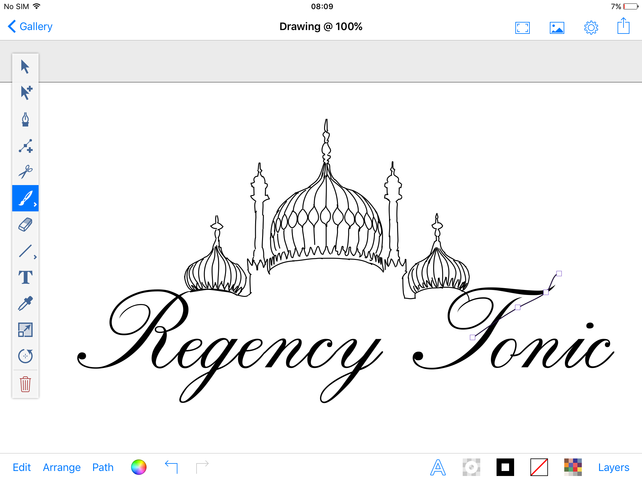
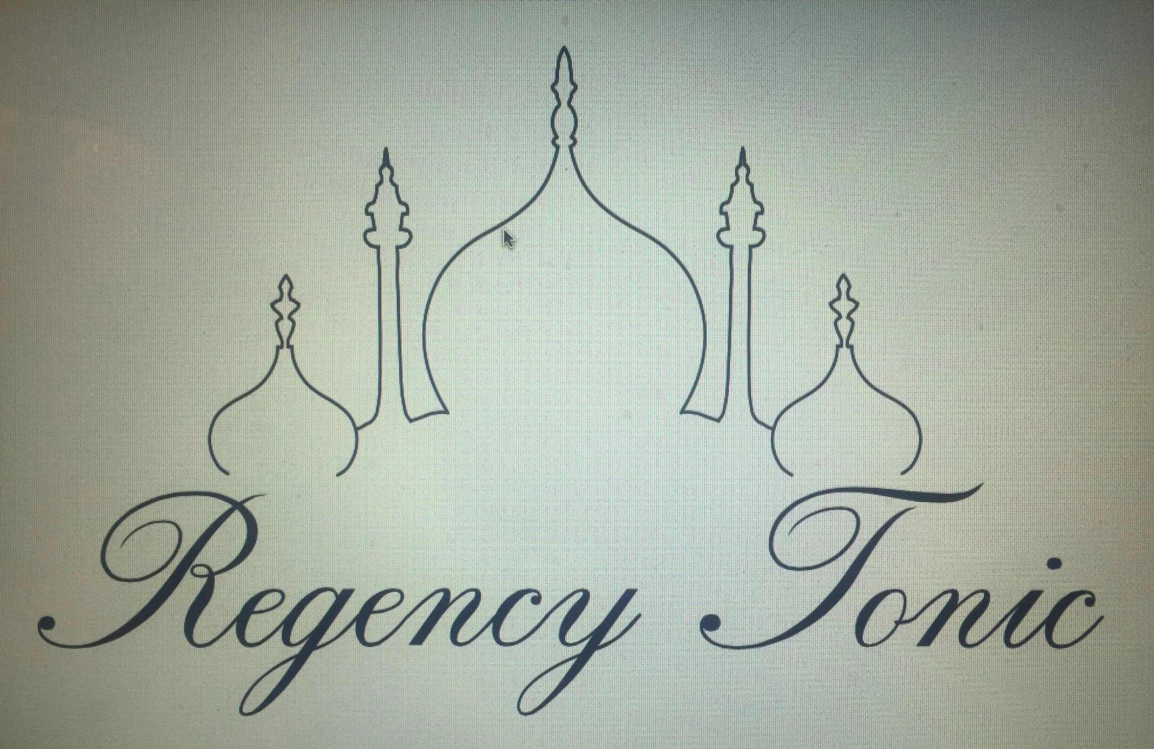
My sister is a resolutely analogue designer. I knew we needed digital designs - ideally vector graphics that we could easily reuse and repurpose across all collateral and at any size. Much scribbling and some painstaking tracing on a laptop touchpad later and we were getting close to a logo we liked.
We now had to turn this into a proper brand identity and incorporate it into front and back labels for our tonic water - and quickly. At this point we knew we needed help from professionals but couldn’t really afford to pay them.
We sat at a meeting with a small agency who were specialists at designing drinks packaging. They’d produced about a dozen concepts for us. We hated them all (the designs - the people were lovely!).
The situation felt awkward. We weren’t used to people pitching at us for work, and felt like we’d wasted their time. It’s hard to say no, especially to nice people. But the designs weren’t right for our business so we walked away and didn’t work with them. A friend of Richard’s was throwing some ideas back and forth with him and one in particular caught our eye - can you guess which?

There was something about the design with the coloured stripes - it was too Soviet? The angles weren’t right, the colours were all wrong, the fonts too. But it had impact - shelf presence perhaps?
To this day I’m not 100% clear on what was agreed with my co-founder’s friend, but there was talk of this label design being donated in return for a small equity stake in the company. This made me nervous. A valuable lesson here - be crystal clear with people whenever discussing an ownership stake in a business - no matter how small. And always be united as a founding team - 100% transparency at all times avoids future confusion. Easy to say, hard to do when you’re in the thick of it with jobs, children, bills etc.
The company wound up before we’d ever even paid ourselves a penny so in this instance it’s moot - but this should have been resolved with a signed contract for avoidance of any future doubt. That’s how I’ve insisted on dealing with equity ever since.
In the end I got impatient, perhaps a little ruthless? I took the inspiration and ran with it, iterating from where I’d got to with my own efforts. Life was a little complicated at the time and money was getting tight - I just wanted to get things done.

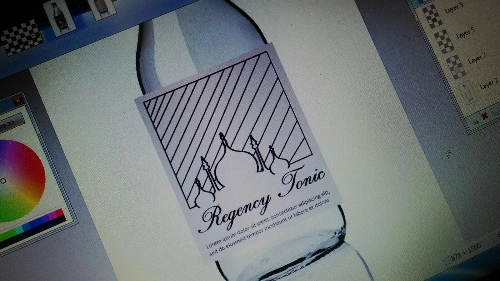
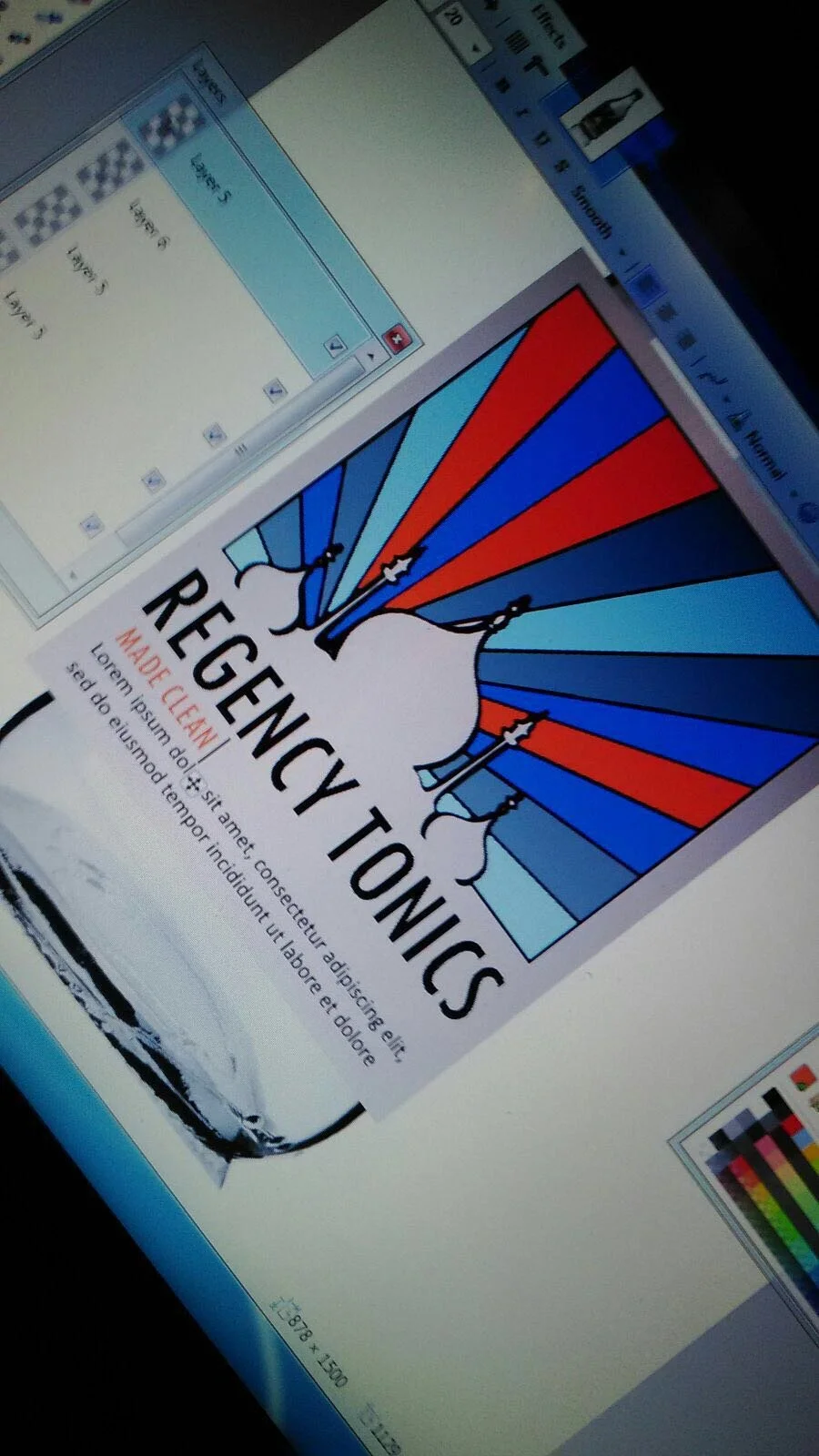
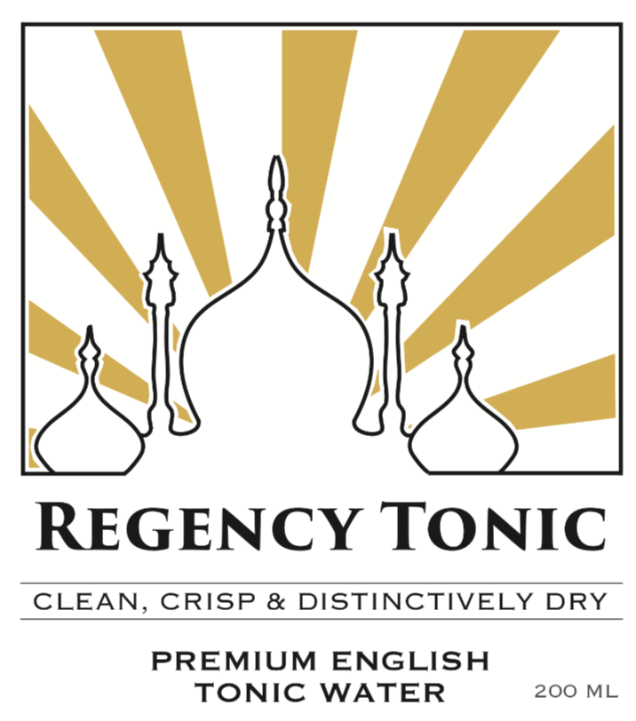
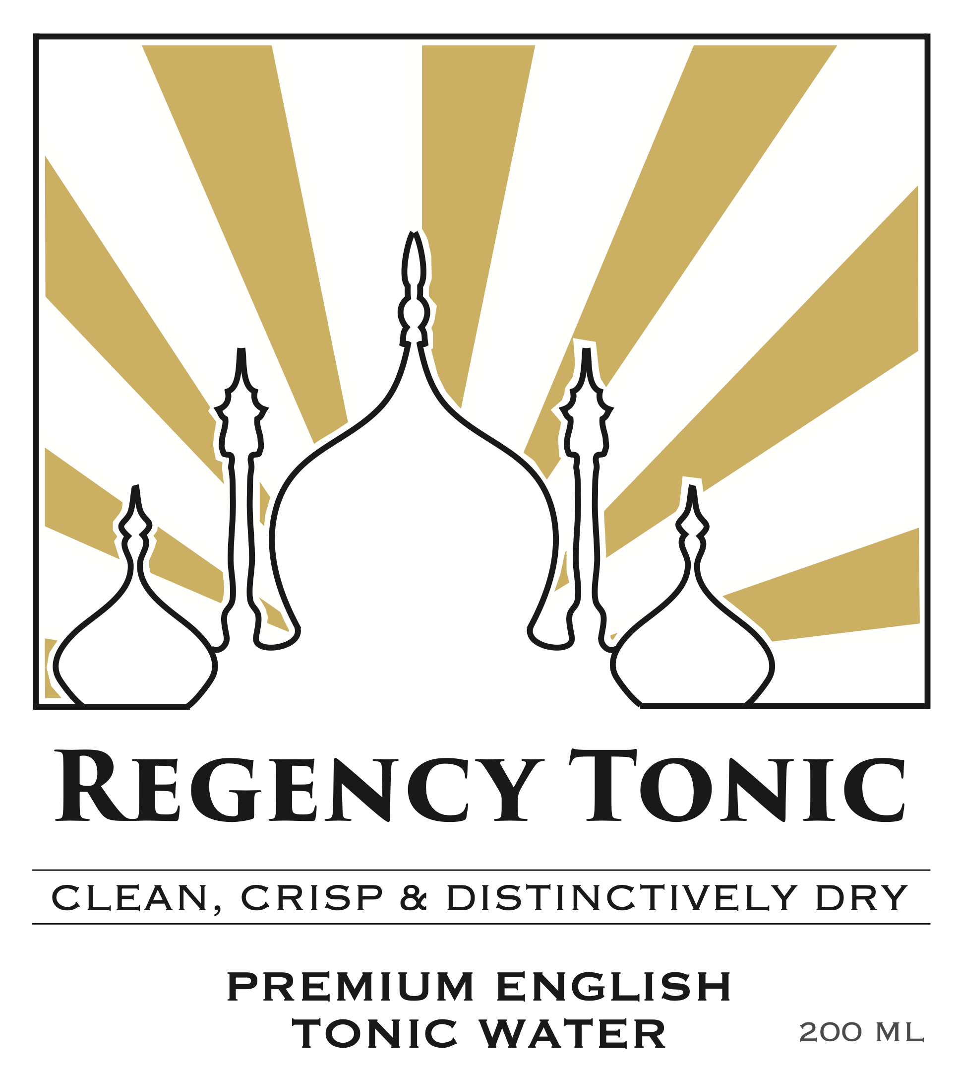
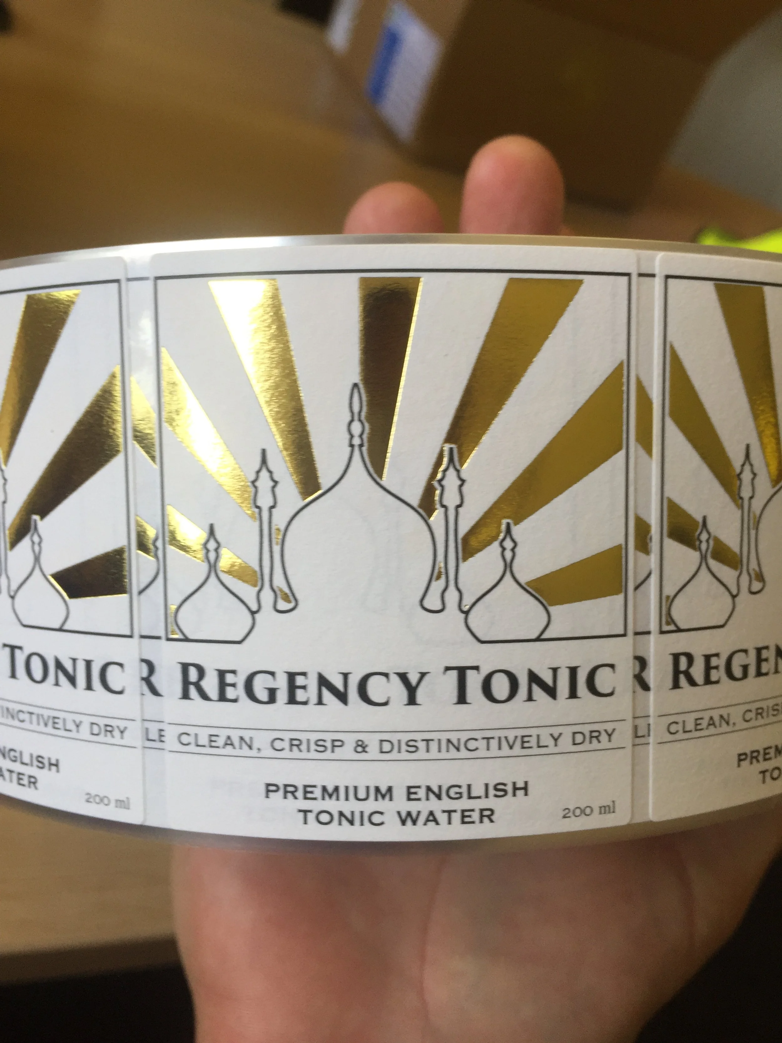
The lines were adjusted to radiate from a single point. A single colour felt more fitting, but what? We started to lay out elements for an impactful front label. At this point we’d agreed on ‘Clean, crisp and distinctively dry’ as our front-of-bottle tagline.
Paper prototyping is fast
It really helped here to prototype with paper. With two-dimensional designs paper is great, with 3D products cardboard and foam are fantastic - you simply can’t beat making things quickly come to life with your hands for rapid iteration. Pens, pencils, printers, scissors and sticky tape are your prototyping friends:
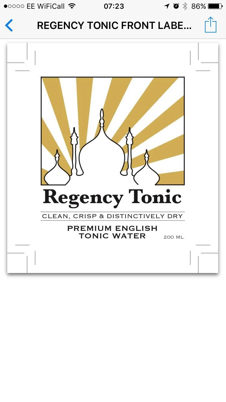
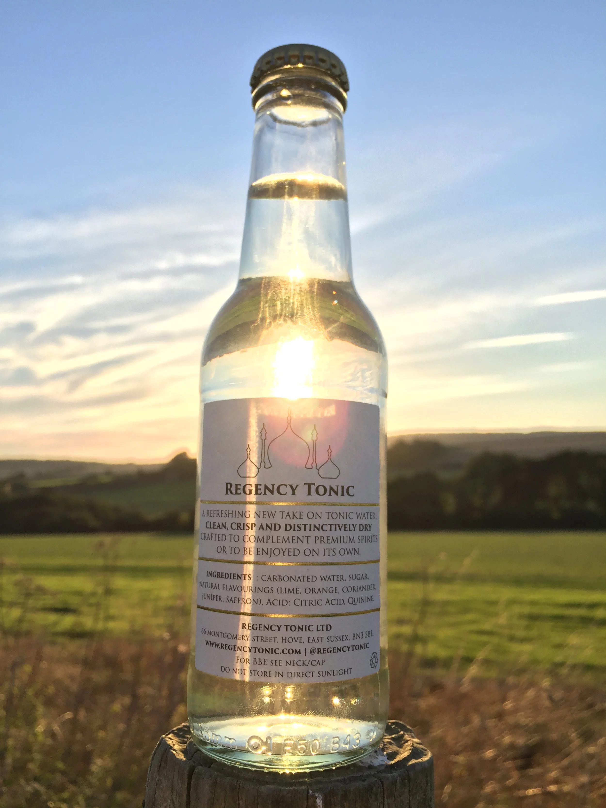
Regency Tonic: Clean, crisp and distinctively dry
Paper prototyping is great. You can swap design elements in and out quickly. It’s rapid, super cheap and can be done anywhere.
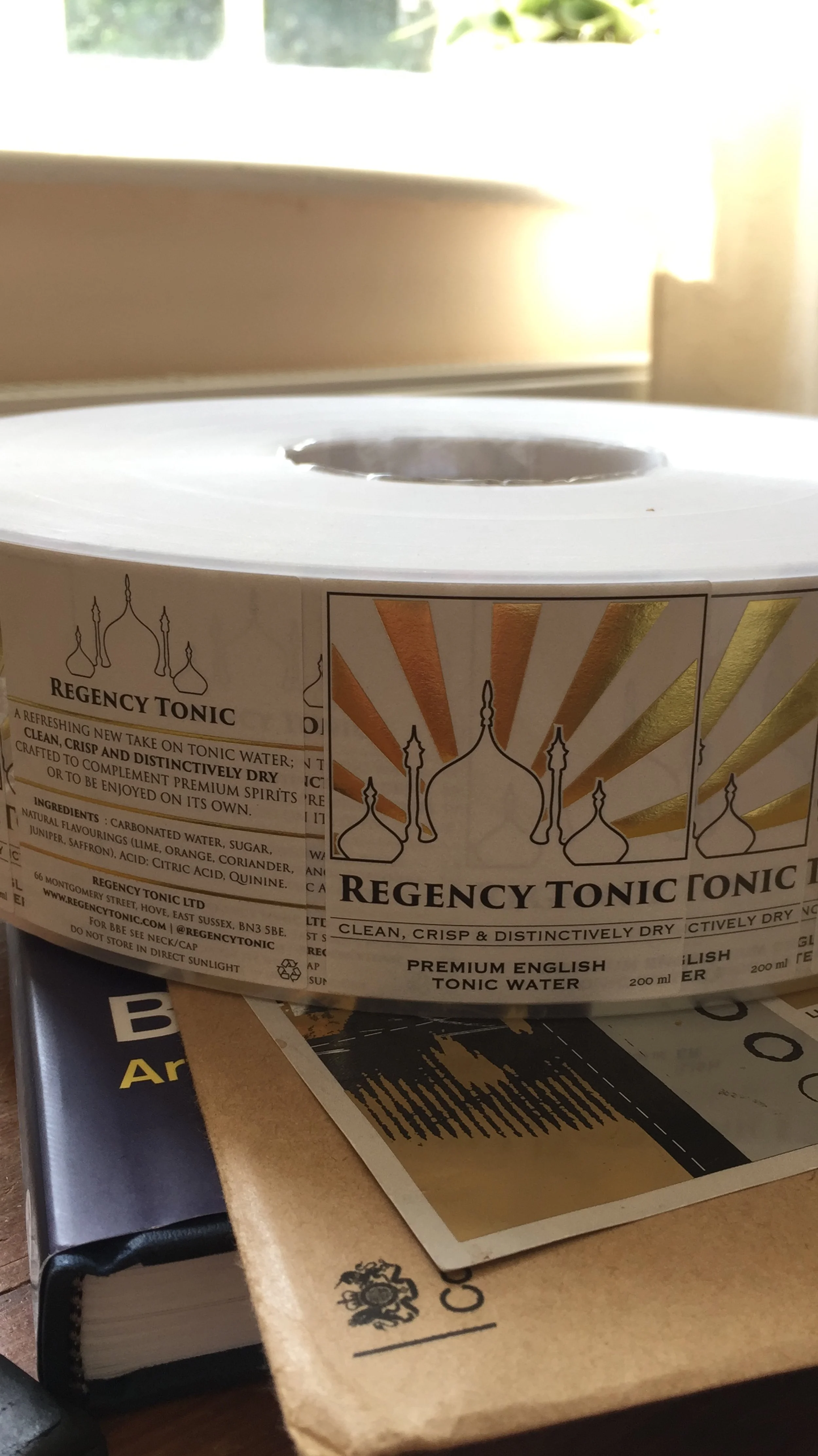
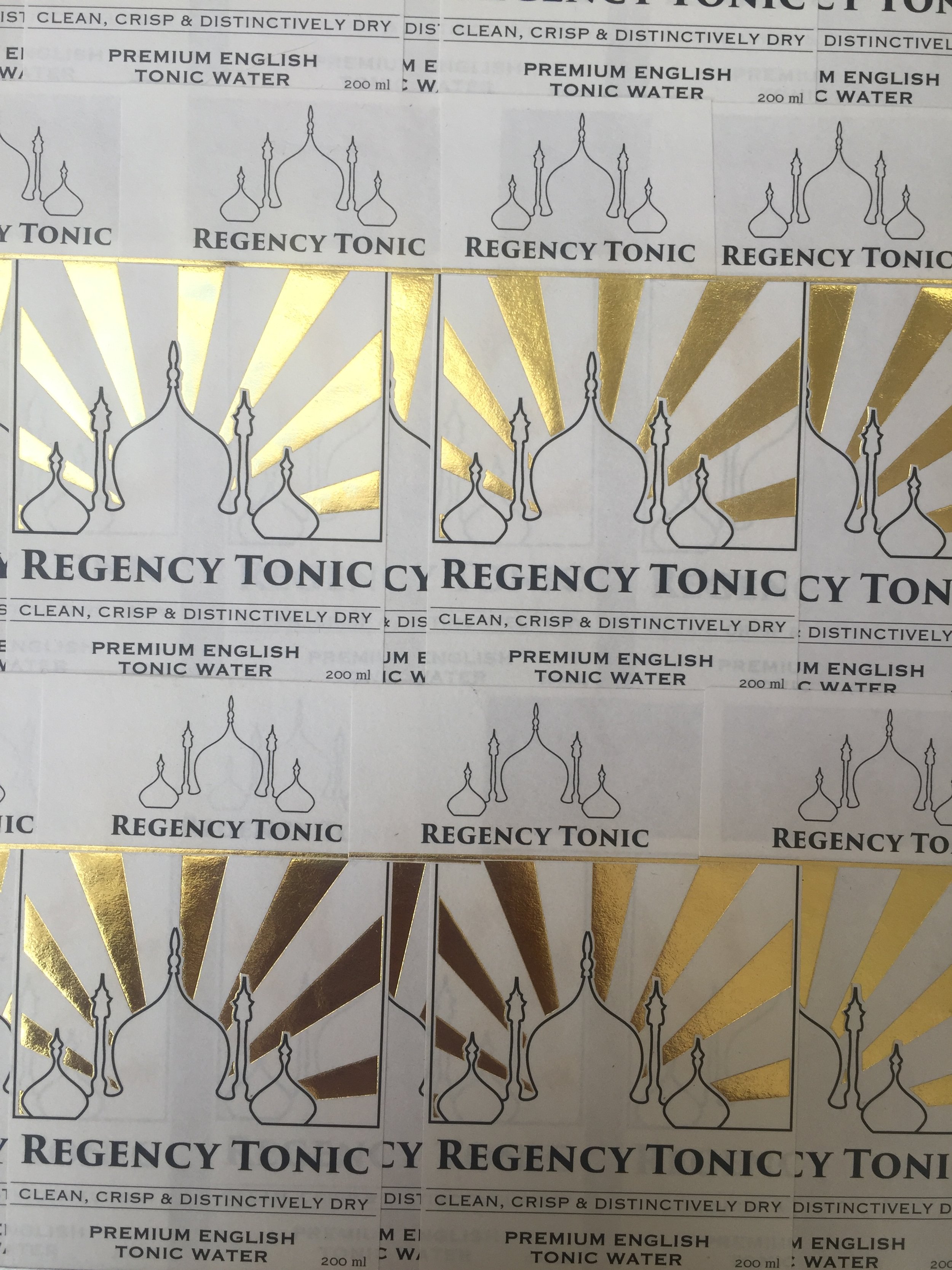
Looking back now I can see that there are well over a hundred files in my Regency Tonic ‘Labels’ folder - all of which were a result of getting just two products to market. Design tip: keep records! Take photos on your phone of physical prototypes. Keep lots of different versions of designs as you iterate digitally - duplicate files and name / number them. Very often we’ve found ourselves going back several steps to earlier iterations that seem better with fresh eyes.
Falling in love with foil
Around this time I was introduced to foiling / hot stamping / foil stamping - a technique that’s been around since the nineteenth century whereby a die is used to stamp out a metallic element on a design.
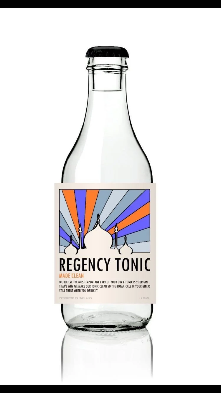
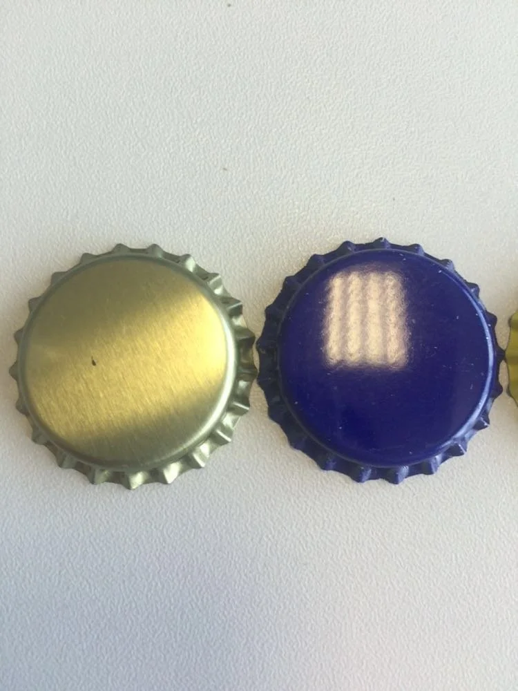
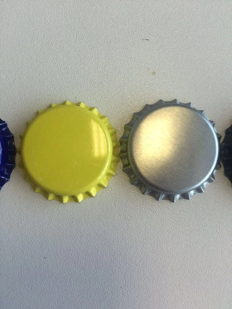
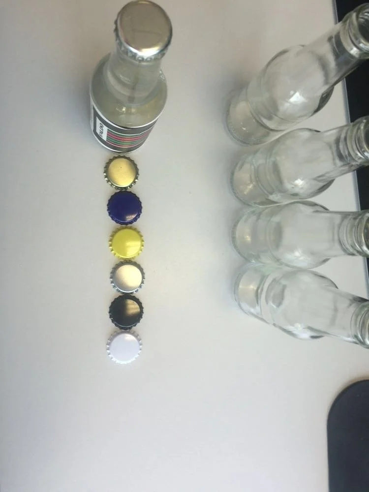
As we started talking to more serious partners we were getting specifications for printing, glass bottles and the colour of crown caps we wanted to use. We liked gold and then noticed a label printer we’d been recommended offered gold foil options for labels. It wasn’t cheap - a die needs to be physically produced so there’s an up-front expense - but we were enticed by the possibility of incorporating gold into our label design. What screams luxury than humanity’s most precious metal?! A little crass perhaps, but people are simple creatures driven by habit. Gold is shiny, catches the eye and looks expensive.

If you’ve only ever spent other people’s money (as an employee) the levels of stress I felt at this stage might seem so strange as to be alien. You’re just choosing packaging - get on with it! But when your last few pounds of credit on already stretched overdrafts and cards are about to disappear to pay for a ‘foiling die’ - something you didn’t know existed the week before - you really want to know that it’s worth it! Fear can be paralysing. And a total lack of funds crippling. Always try to keep some cash in the bank.
There’s no way to tell for sure if you’re making the right decisions in business, especially when you’ve never done something before. There are a thousand leaps of faith to take. Like a muscle you can train yourself to simply get more comfortable operating in uncertainty. It’s liberating.
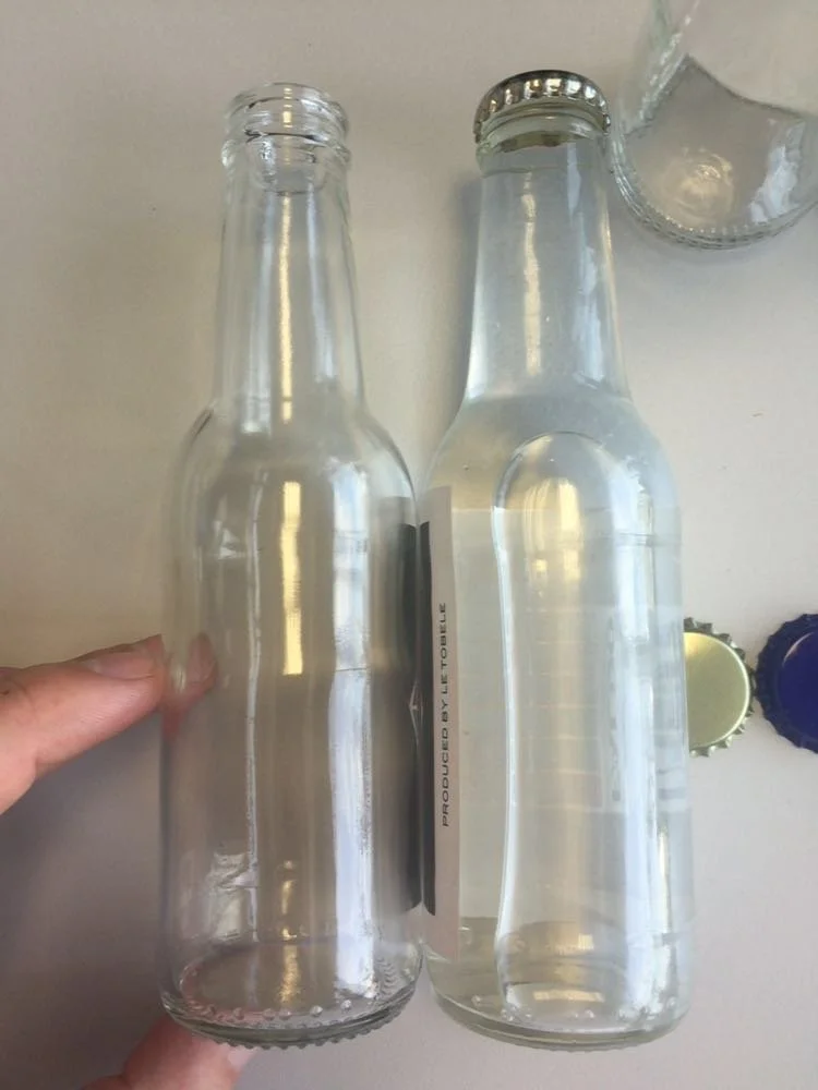
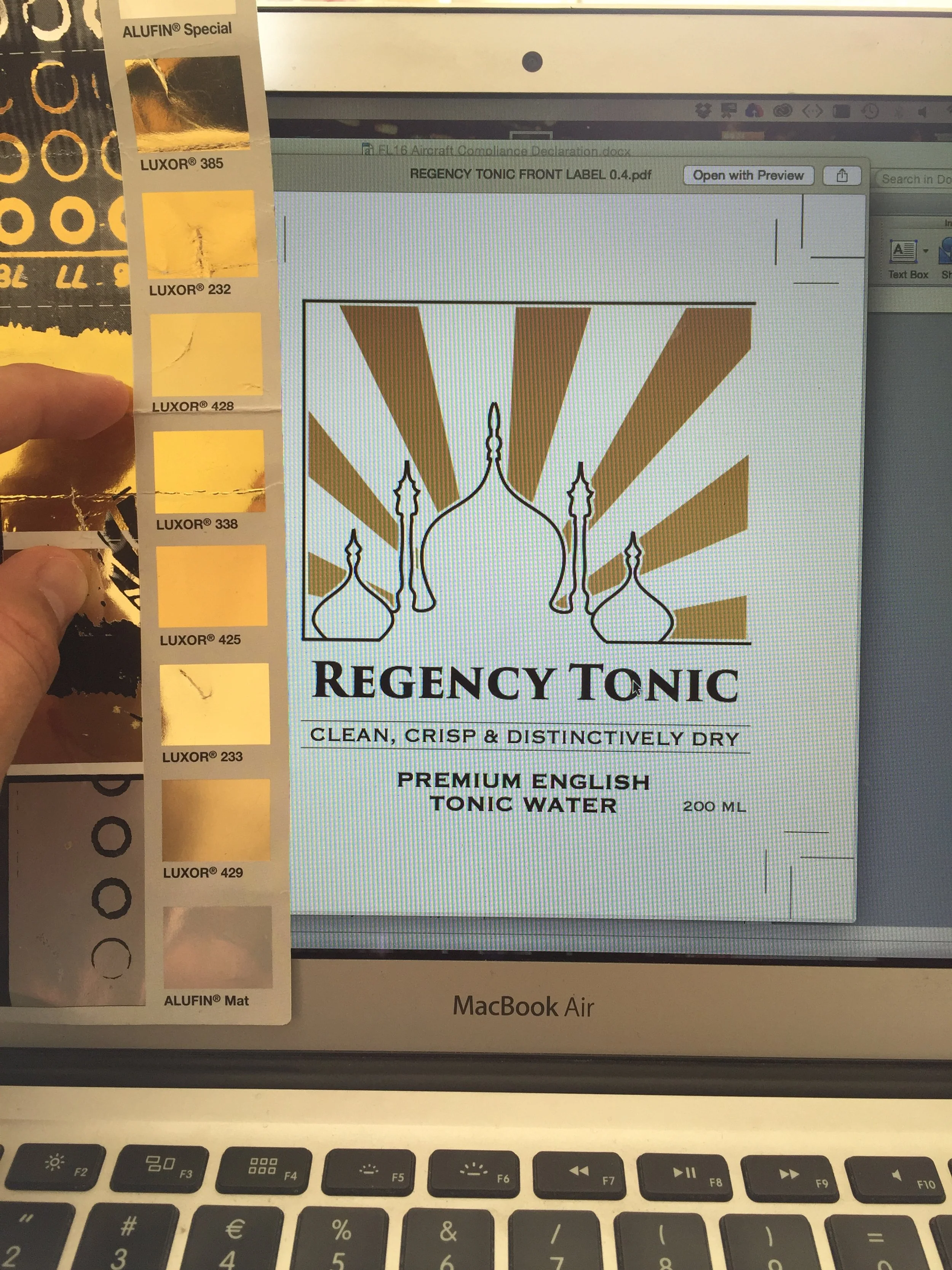
We chose our favoured gold foil and I studied print specs learning valuable lessons. Every production process works to tolerances. I had to finesse our design to work within the specs of the machinery on which it was to be produced. If it’s not your machine, you're working to someone else’s tolerances. Study and understand them. Here we just had to finesse gaps between the gold foil elements of our design to ensure they didn’t overlap printed designs - I think the tolerance was c. 1mm,
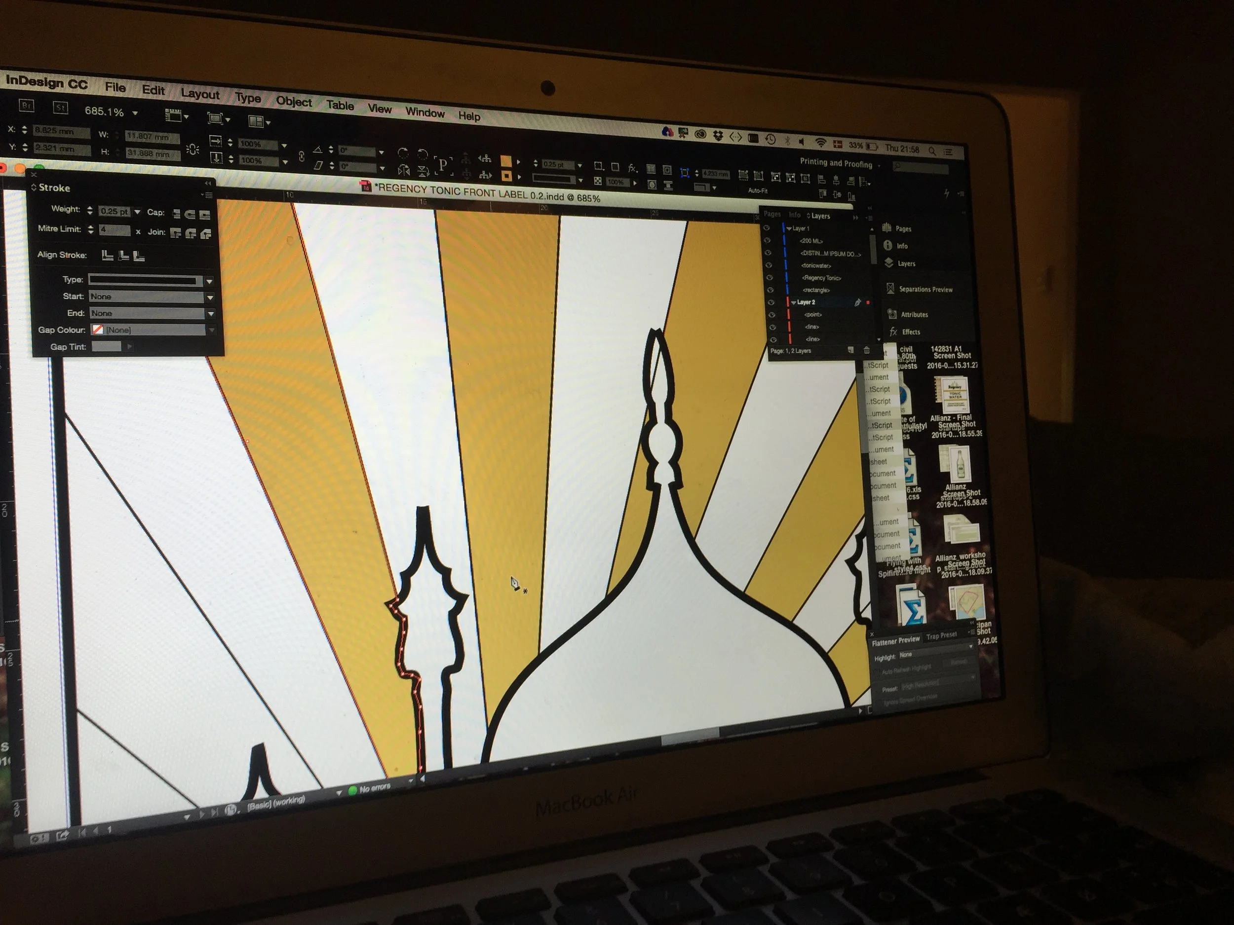
We’ve come across similar problems with other businesses and products we’ve launched in entirely different industries since. When you’re not in control of production you need a very close and professional line of communication with the people making your product to avoid mistakes.
It was important for us to understand that the label print and hot foil were a two-step process. No matter how well machinery is calibrated and operated there are limitations as to how similar product from different runs will turn out. Differences can be minimised but rarely eliminated entirely. What saved us from an expensive mistake here was listening to our supplier and having a tight feedback loop back into our design process. It’s easy when there are two of you - but the same rules apply in any size of organisation. Design and production have to maintain open lines of communication.
It’s interesting to see the files that went to the printer almost a decade after I made them. I immediately see almost a dozen things I’d change!
Without the foiling the digital versions look a little flat / drab. There’s always a leap of faith in going from digital design to physical product. I wasn’t accustomed to this - I’d built websites before, commissioned iOS apps and assembled presentations. Changes can be made at any time when you’re working solely in the digital domain. Not so with physical product. It requires an adjustment, a greater attention to detail and design discipline - the real world is less forgiving than virtual worlds!
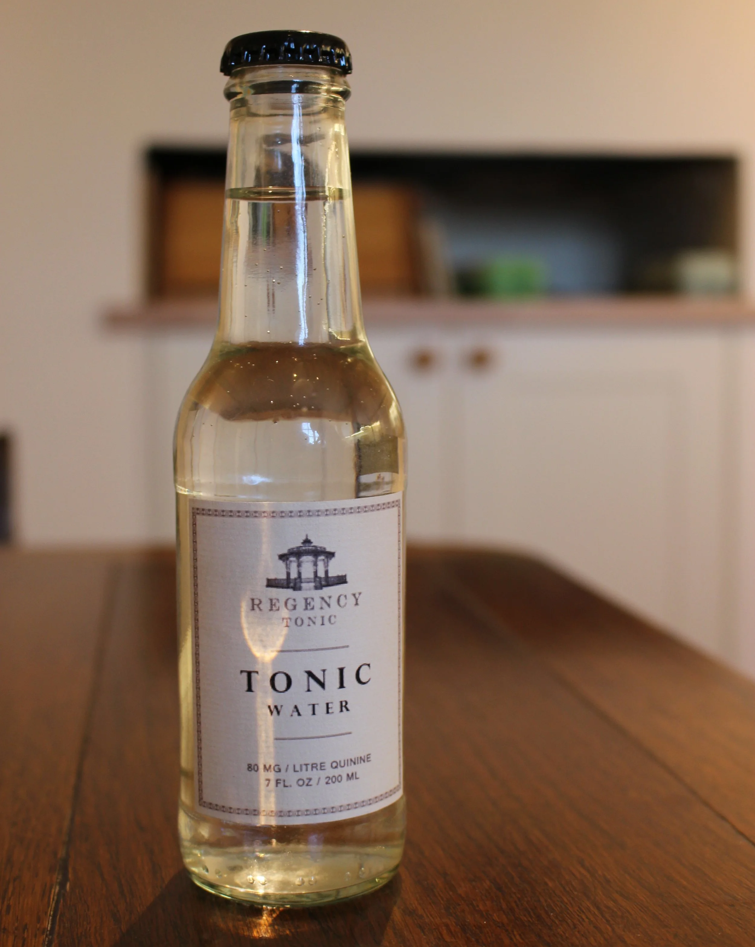
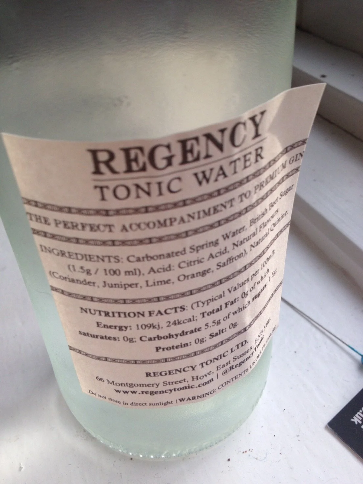
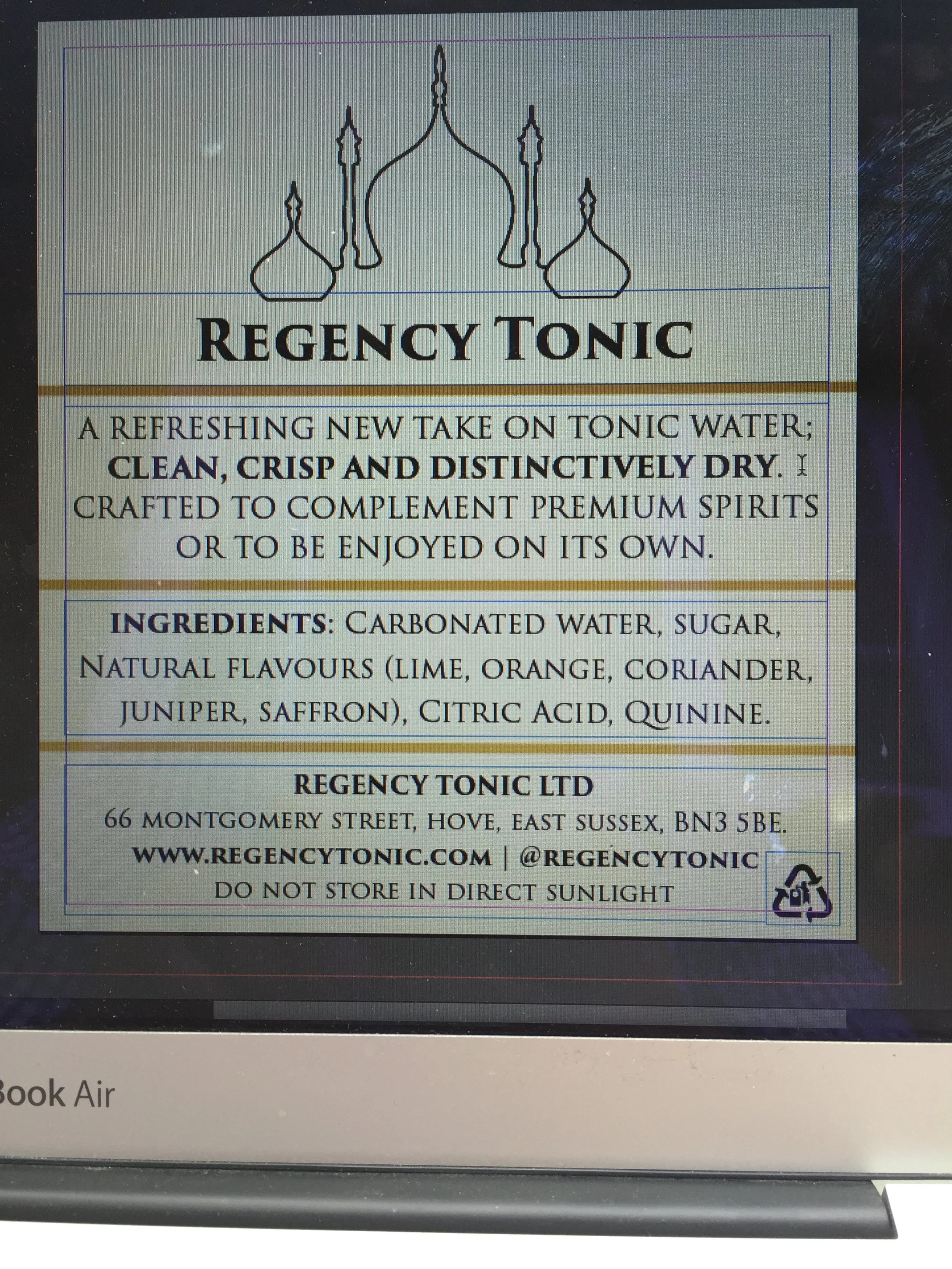
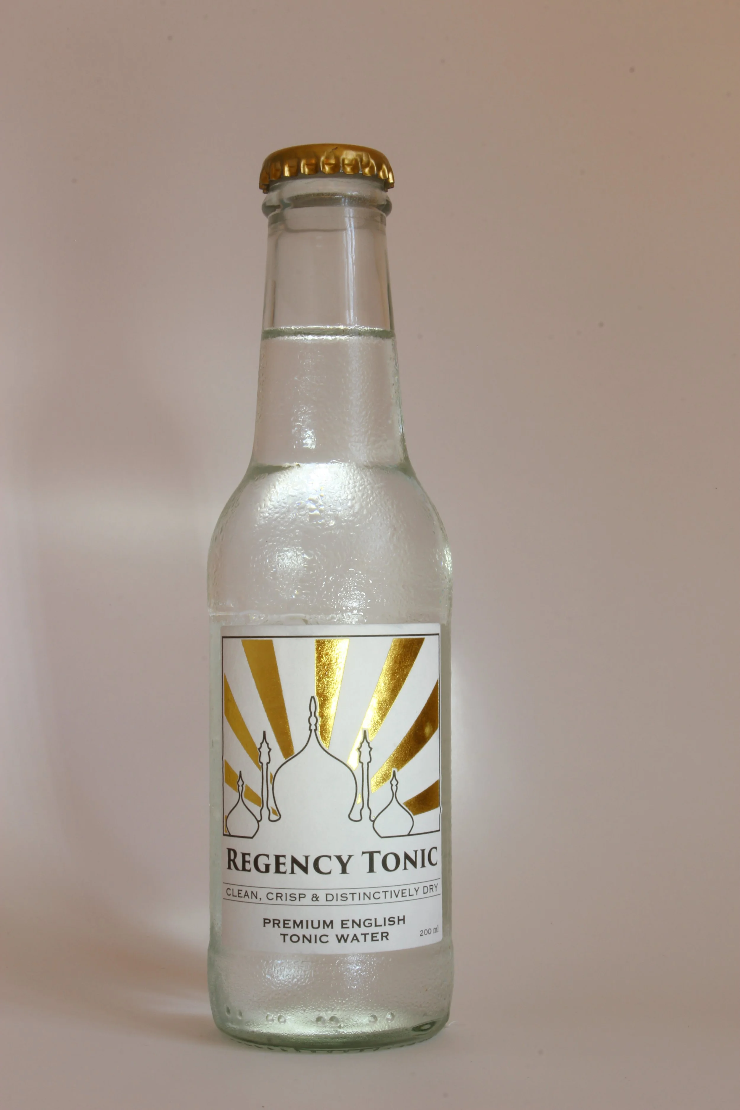
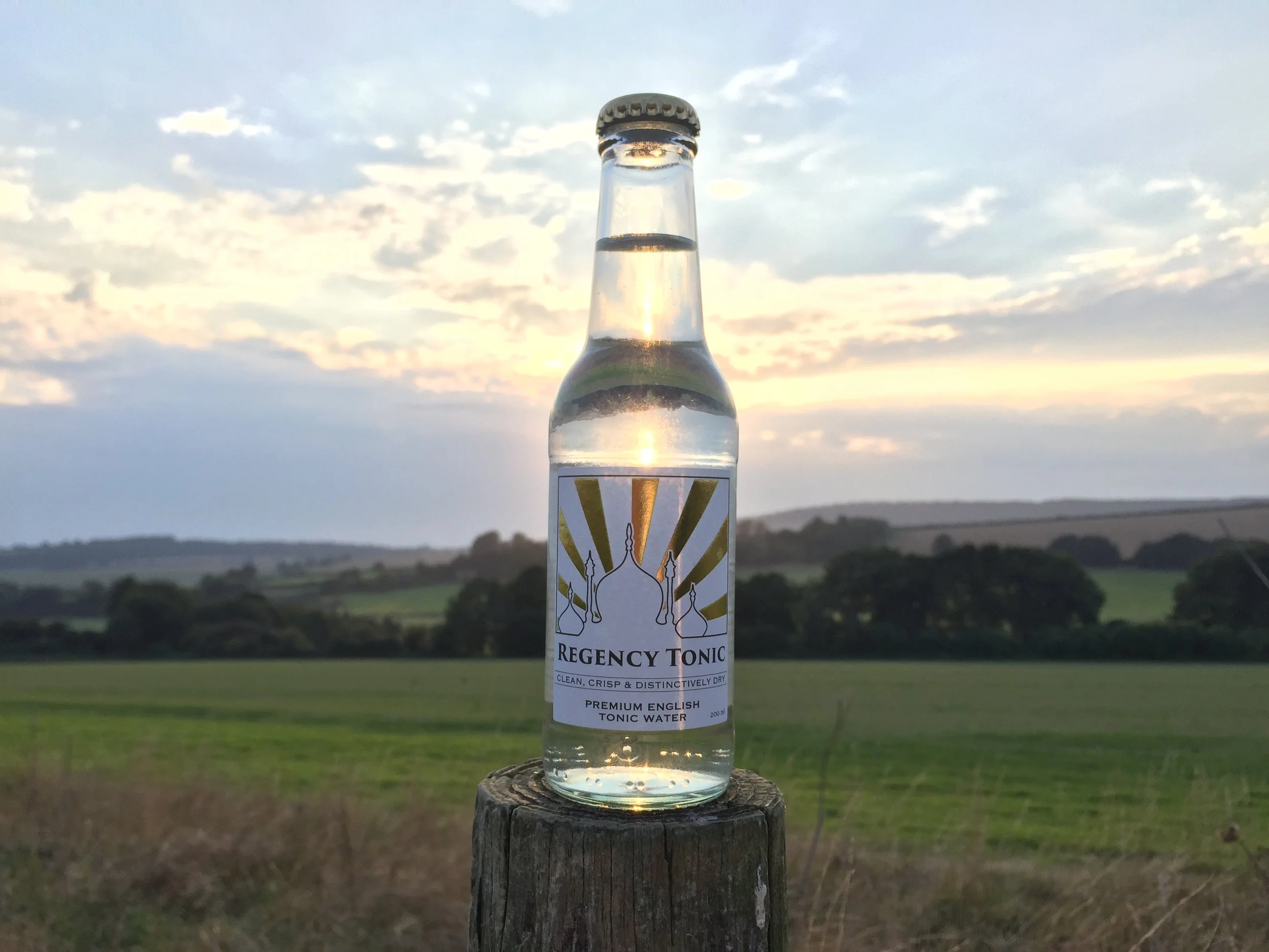
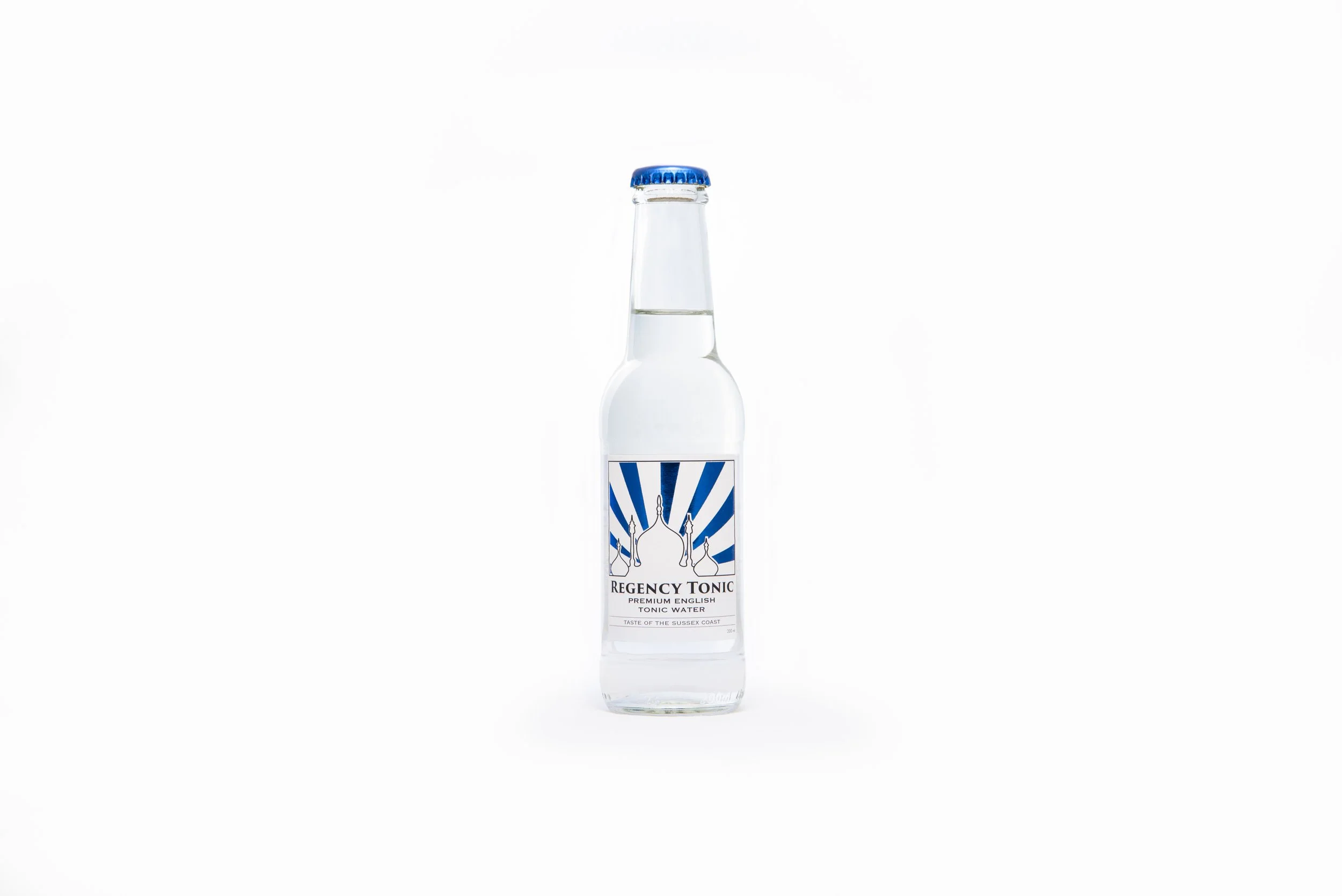
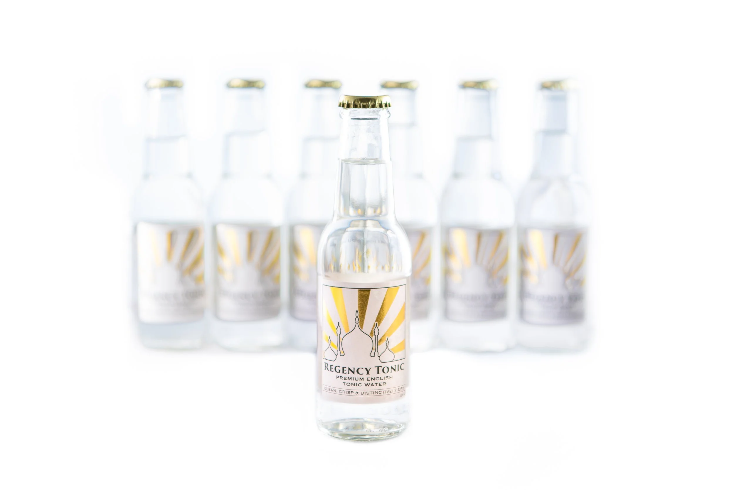
We went through at least twelve different versions of these ‘final’ designs before locking it in and committing to our first print run. I suspect I was a nightmare to deal with for our label printers - Berkshire Labels. We were pleased with the results (and I no longer apologise for being a picky customer):

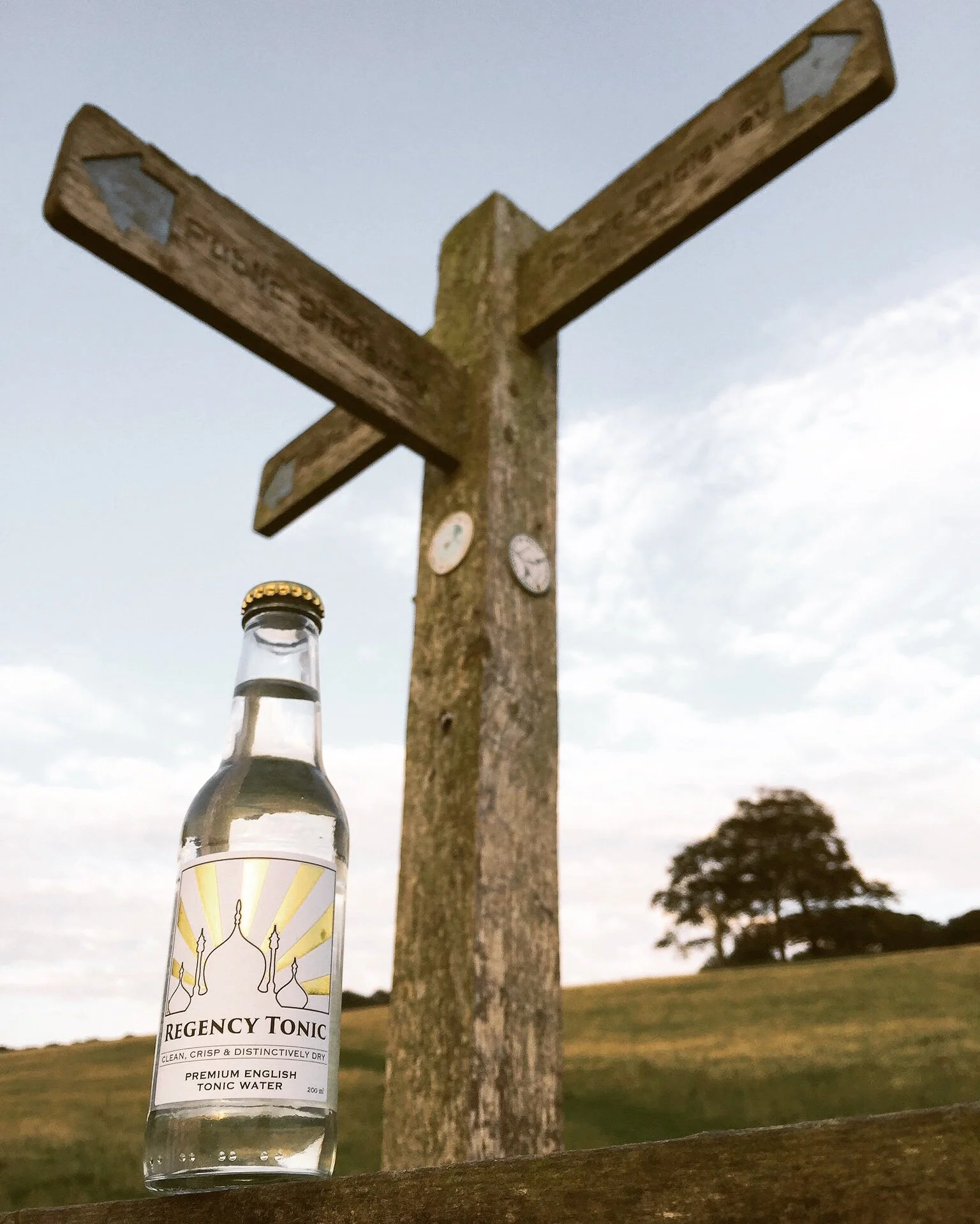
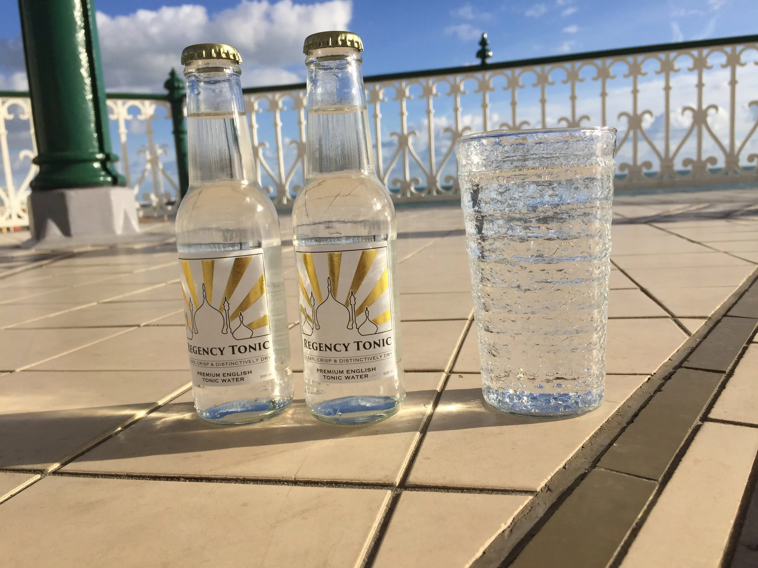
Our next problem came quickly however - it turned out that taking good pictures of tonic water bottles is not easy:
Professional product photography is hard, even if you have decent equipment
Round bottles are a nightmare to frame
Reflective surfaces - glass and gold foil for example - are problematic too
Pay a professional photographer!
Better photos = more sales, often at higher prices. In our experience it really is that simple.
No matter how skilled you might fancy yourself behind the lens there’s almost certainly someone who’s better. Find them and pay them. We’ve never regretted money spent on professional photographers. We play with AI tools too and often spend more time/money trying to get desired results than we would have by simply paying a professional. You think they aren’t working AI tools into their daily workflow more effectively than you? You’re wrong.
Consumer goods typically necessitate product and lifestyle shots. They’re different disciplines that are equally hard to execute well. Here are some of our own abysmal efforts - good enough for some low-rent social media posts and coverage in local newspapers perhaps, but they didn’t do our brand or bottle justice.
Soon our own customers were posting more professional pictures online than we were! We spent some of our precious early revenue on commissioning professional product photography. All the Instagram filters in the world will never hide the fact that you’re too cheap to pay for proper product photos. You need them. Resellers and stockists need them. Sales people need them. They’re essential.
We were starting to make inroads into the on-trade in London; fielding enquiries from five-star hotels and high-end spirits brands as well as from Sussex vineyards getting into the gin game. The way we presented ourselves to the world needed to be more credible. An amateurish look was a direct impediment to doing deals with more prestigious clients, as were some uncomfortable unit economics (that we’ll dive into in another post) - the mixer market is all about volume.
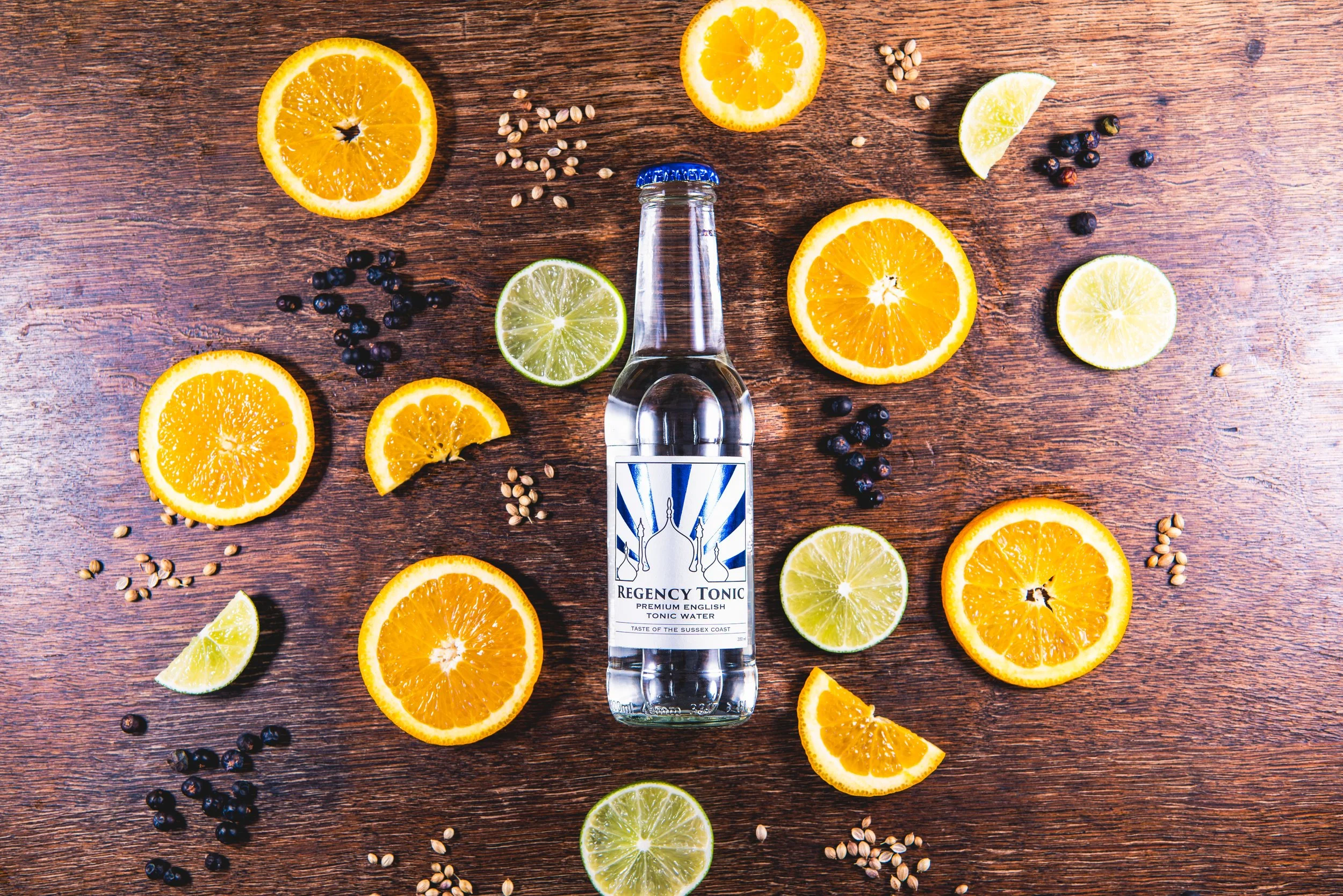
A friend who’s a professional photographer - Jayson Fong - agreed a reduced rate for a shoot in my kitchen to help us launch our second product - Regency Tonic Blue. We were growing the range and had tweaked our recipe a little in response to feedback (in hindsight this might have been a mistake). We think the results of the photoshoot speak for themselves. A real step-up in quality.

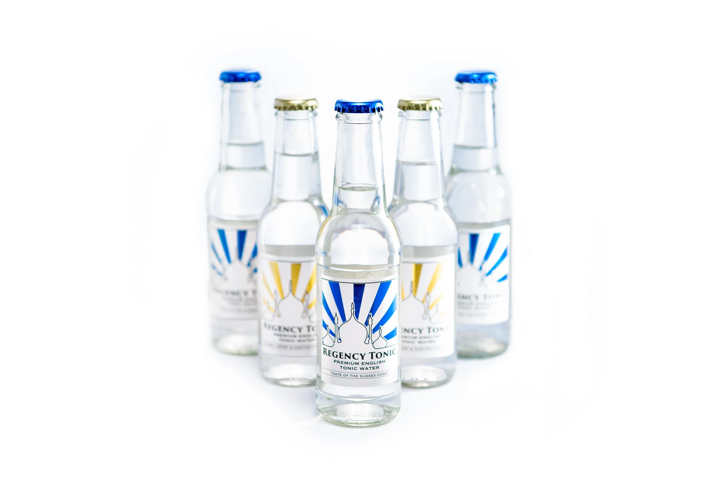
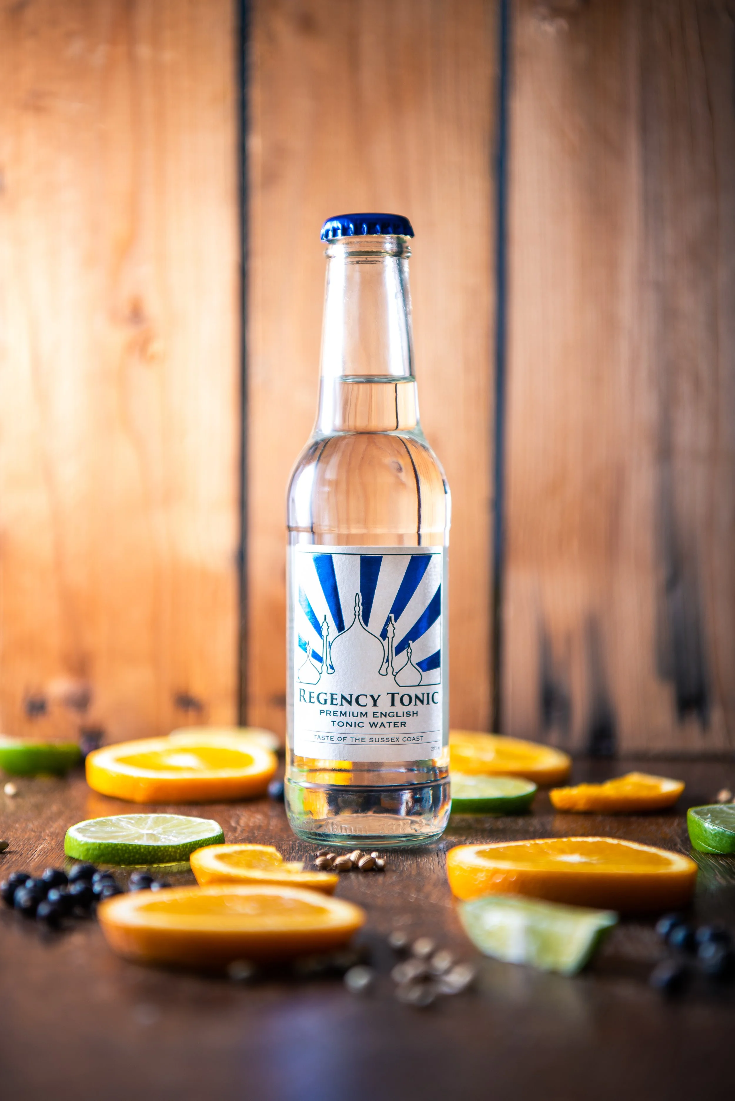
This worked because:
Jayson is a skilled and consummate professional photographer
We worked on a thorough brief ahead of time - everyone in the room knew what we were trying to achieve from the outset of the shoot
The lifestyle shots (below) were somewhat less successful - and this was on us. I now appreciate why you really need a controlled set / location (not just your kitchen) for a product photoshoot. A range of backgrounds, control over lighting, models and a whole host of props also help to properly pull off high quality lifestyle shots.


We commissioned these pictures just before we went out of business and so never got to use them. To this day that’s a real sore point.
The commercial failure of the company was partly due to naivety on my part but wasn’t helped by some appallingly dishonest behaviour by suppliers and partners. We should have been tougher and dealt with people with more confidence.
We’ll do a post mortem on the strategy and commercial aspects of Regency Tonic’s demise in a separate post, but as I hope is evident, we came away from the experience with a huge amount of valuable knowledge and experience.
If you’d like to work with us on graphic design, product design, production, planning, strategy - or any other business challenge then please don’t hesitate to reach out.
We’re always open to talking about our past business successes and failures, and are particularly keen to collaborate with fellow entrepreneurs and business owners.